Overview
SES Magazine appeared in coordination with conferences in five international markets; these events drew a total of over 5,000 digital-marketing professionals per year. (The SES, or Search Engine Strategies, conference series was later rebranded as ClickZ.) I redesigned the publication, establishing consistent typography and layout.
I produced 15 issues, executing the design as well as editing copy. Visit the SES page at issue.com to view them (see the issues dating from May 2011 to October 2013).
Go back to see samples of covers.
View an infographic I created for the magazine.
Selected Work
Before and After: Table of Contents
The revised layout has more even spacing and a refined type treatment. By increasing the leading, setting a baseline grid, and using a full-width rather than a condensed font, I made the blocks of text more readable and visually pleasing.
Before

After

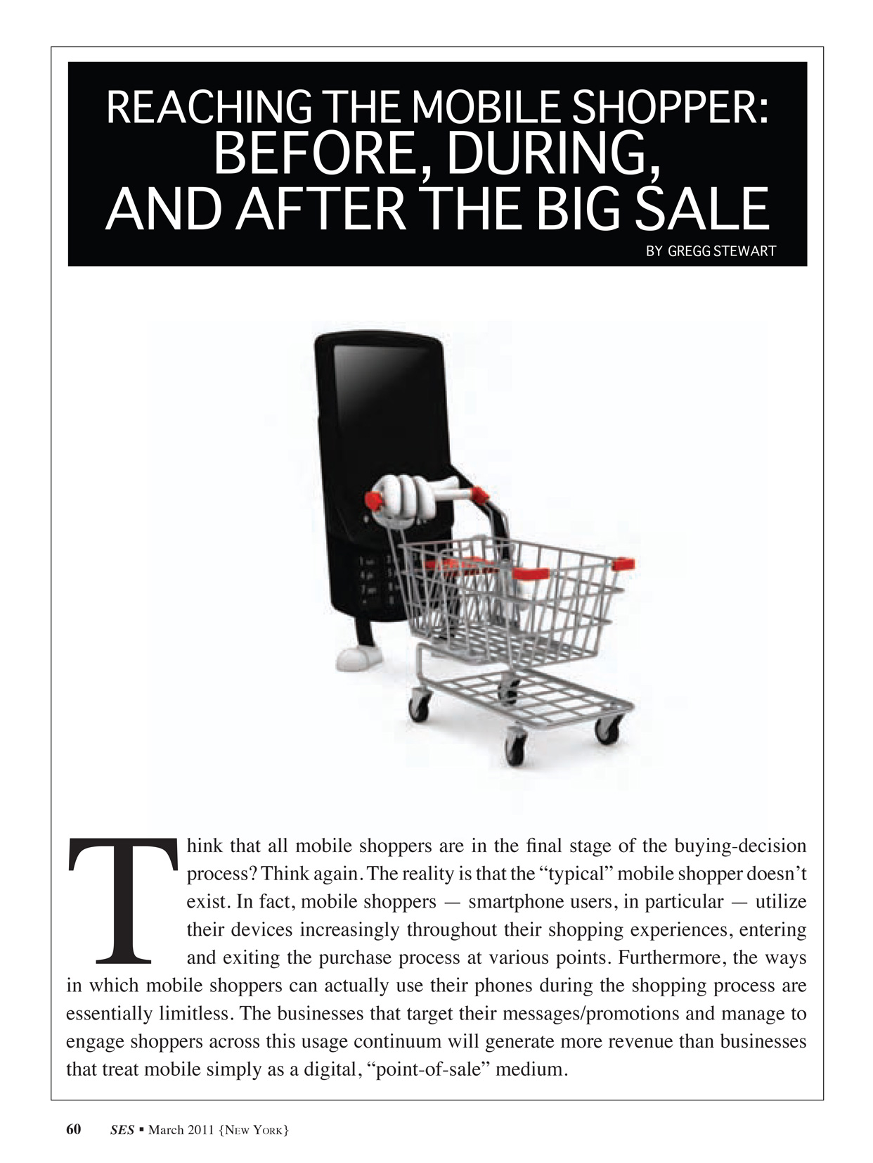
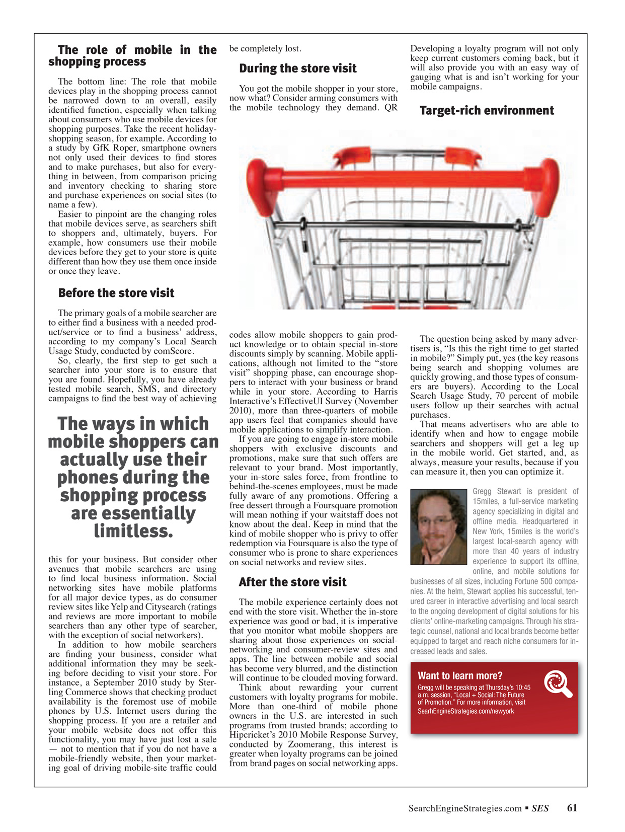
Before and After: One‑Page Article
The elimination of unnecessary stock imagery opened up space for content. I increased the leading, which permitted the type to breathe, and adhered to a baseline grid. I also established a hangline for the copy; this created both white space and room for a subhead. The result is a much more accessible and professional-looking page.
Before

After

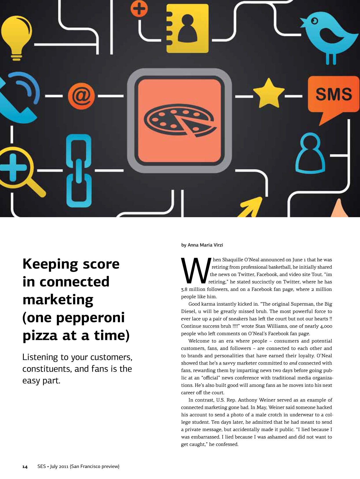
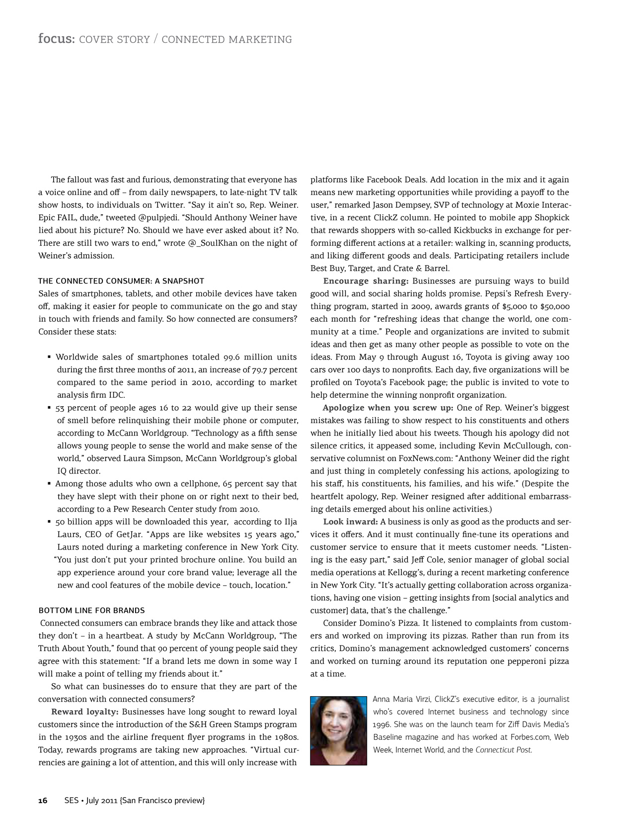
Before and After: Feature Article
The first page in the “after” example shows a more sophisticated use of stock art (due to budgetary limitations, I could not commission original pieces). It has a more subtle headline treatment and a narrower, more readable column of type. On the second page, I avoided unnecessary imagery, allowing for comfortable white space and leading. The baseline grid is consistent.
Before and After: Agenda
With the maroon background limited to the header, the redesigned page is cleaner. I used color to denote content tracks, making the agenda more comprehensible at a glance.
Before

After

Before and After: Sessions
Again the type is more elegant and approachable thanks to the baseline grid and increased leading. As in the agenda above, color coding indicates content tracks. I removed the superfluous clock graphic.
Before

After

Before and After: Sponsors
I eliminated the colored boxes that distracted from the important elements—namely, the sponsors’ logos. By moving the logos to the right edge of the columns, I better utilized the space and improved the flow of type. I made the same typographical enhancements that I discuss above.
Before

After


