Infographic Design

Overview

I have designed infographics for a wide range of audiences including teachers, researchers, marketers, and financial professionals. My work has appeared in reports, slides, educational resources, brochures, emails, and event guides. With the proven ability to plot graphs, draw vector graphics, create icons, and lay out text, I can organize content and refine ideas to meet your needs.

Products and Services

  • Organization and refinement of content
  • Vector graphics
  • Graphs
  • Icons
  • Timelines
  • Slide decks
  • Instructional materials
  • Reports and white papers
  • Responsive emails
  • Event collateral
  • Brochures
  • Accessibility*

*I have modified some design examples from their original versions in order to comply with WCAG standards. Significant changes are noted in project descriptions.

Selected Work

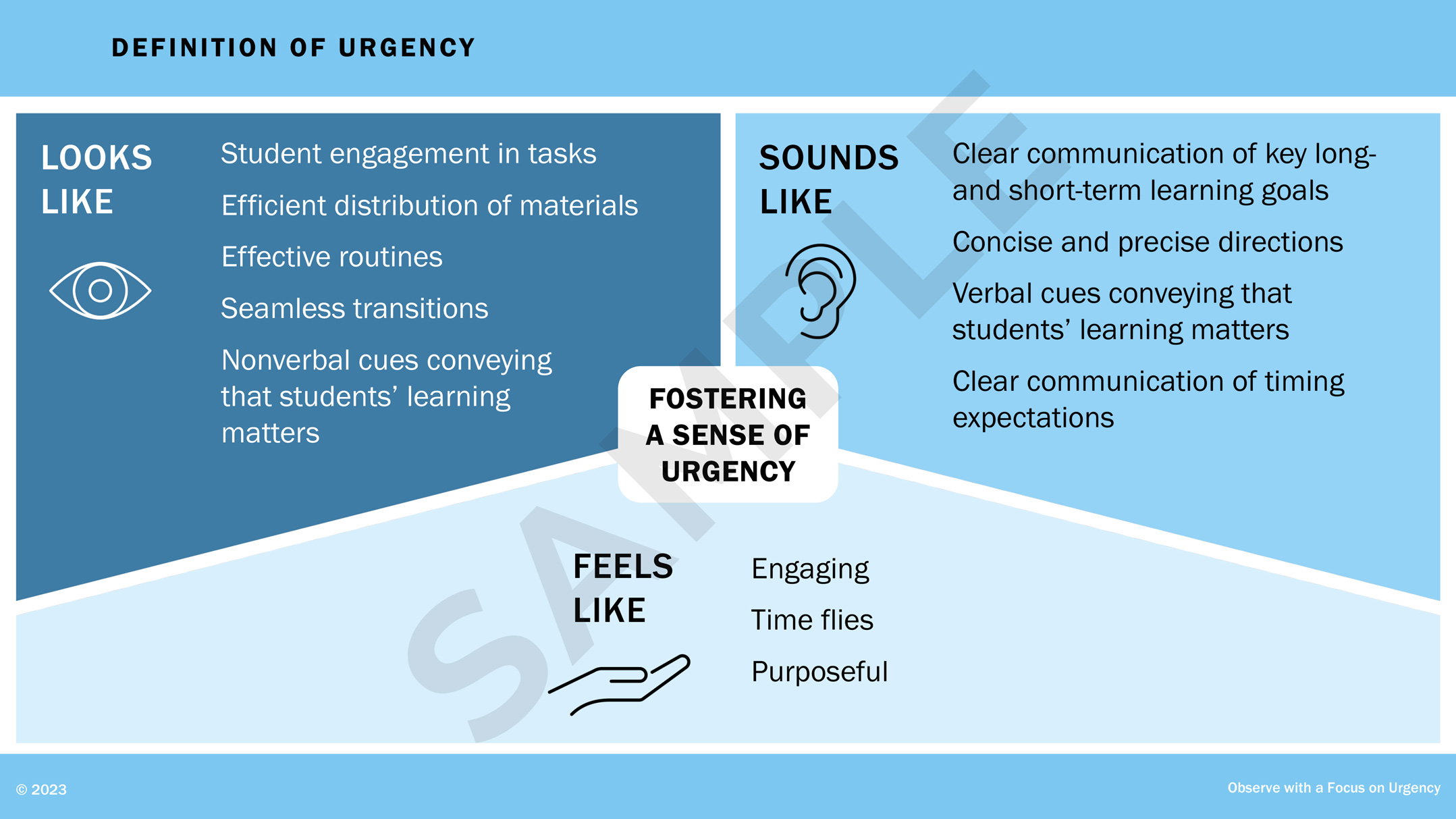
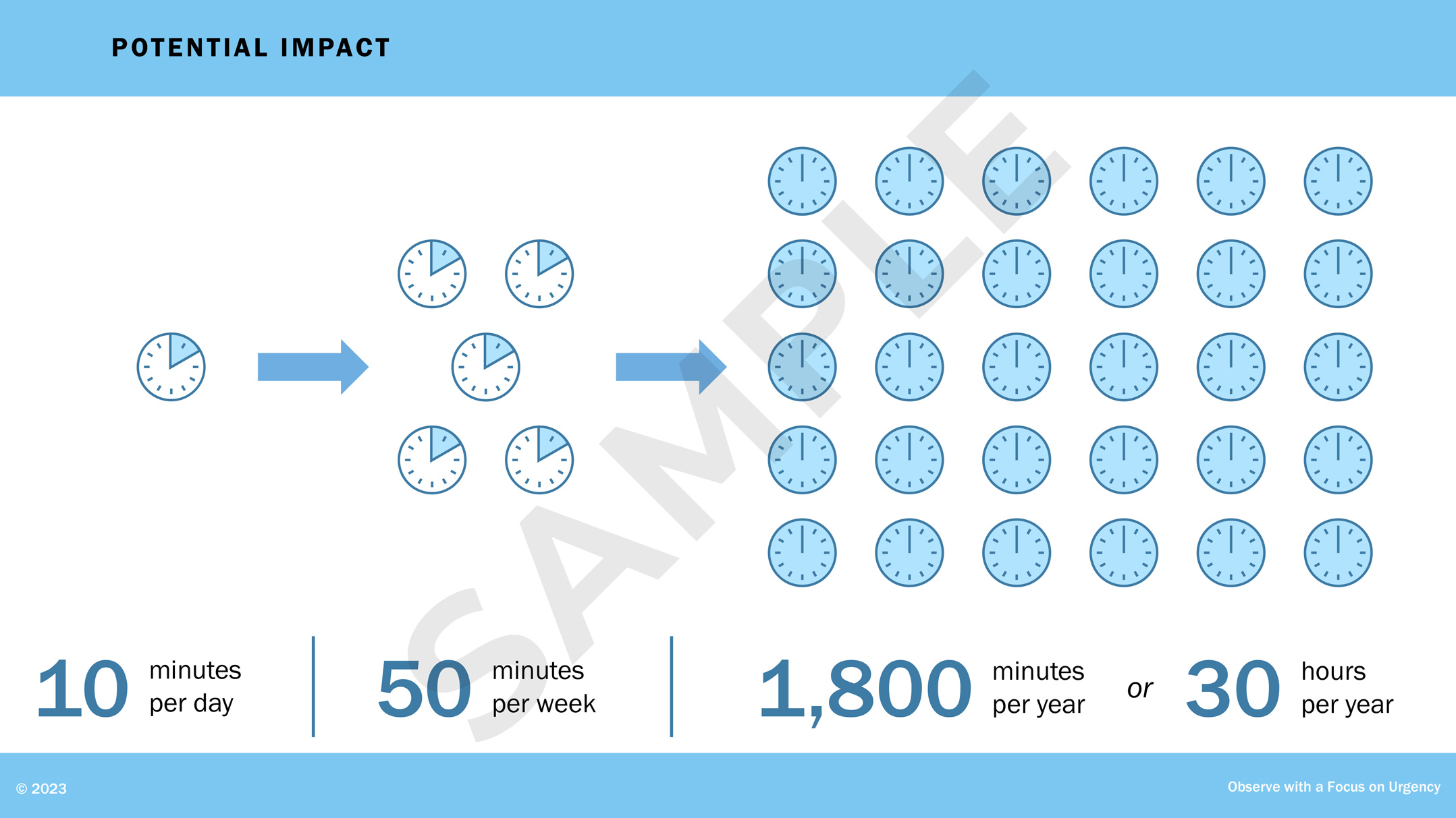
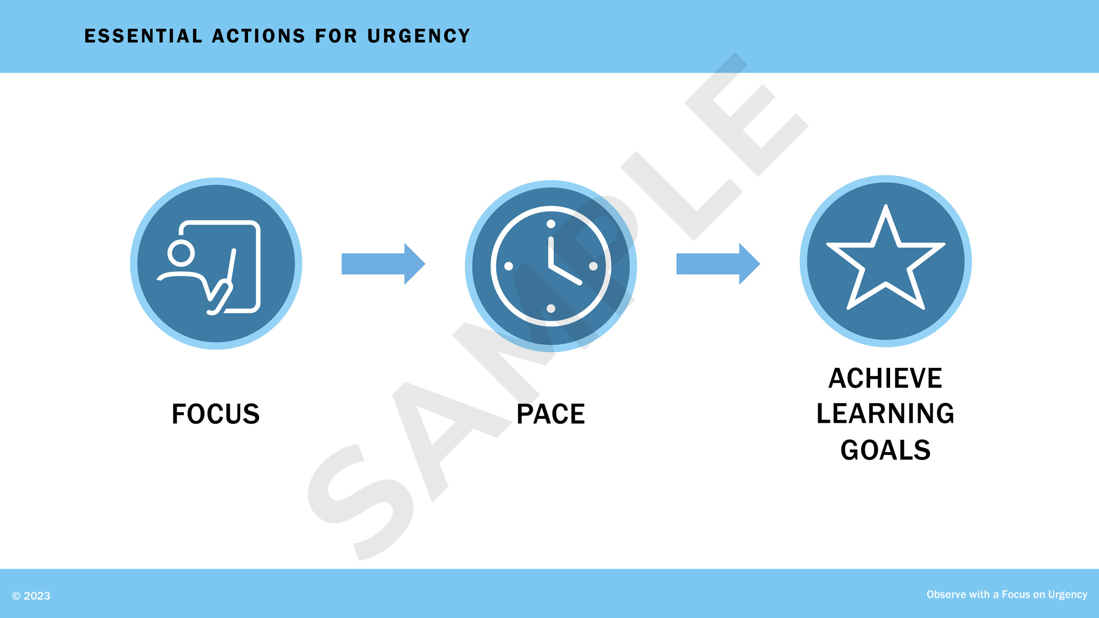
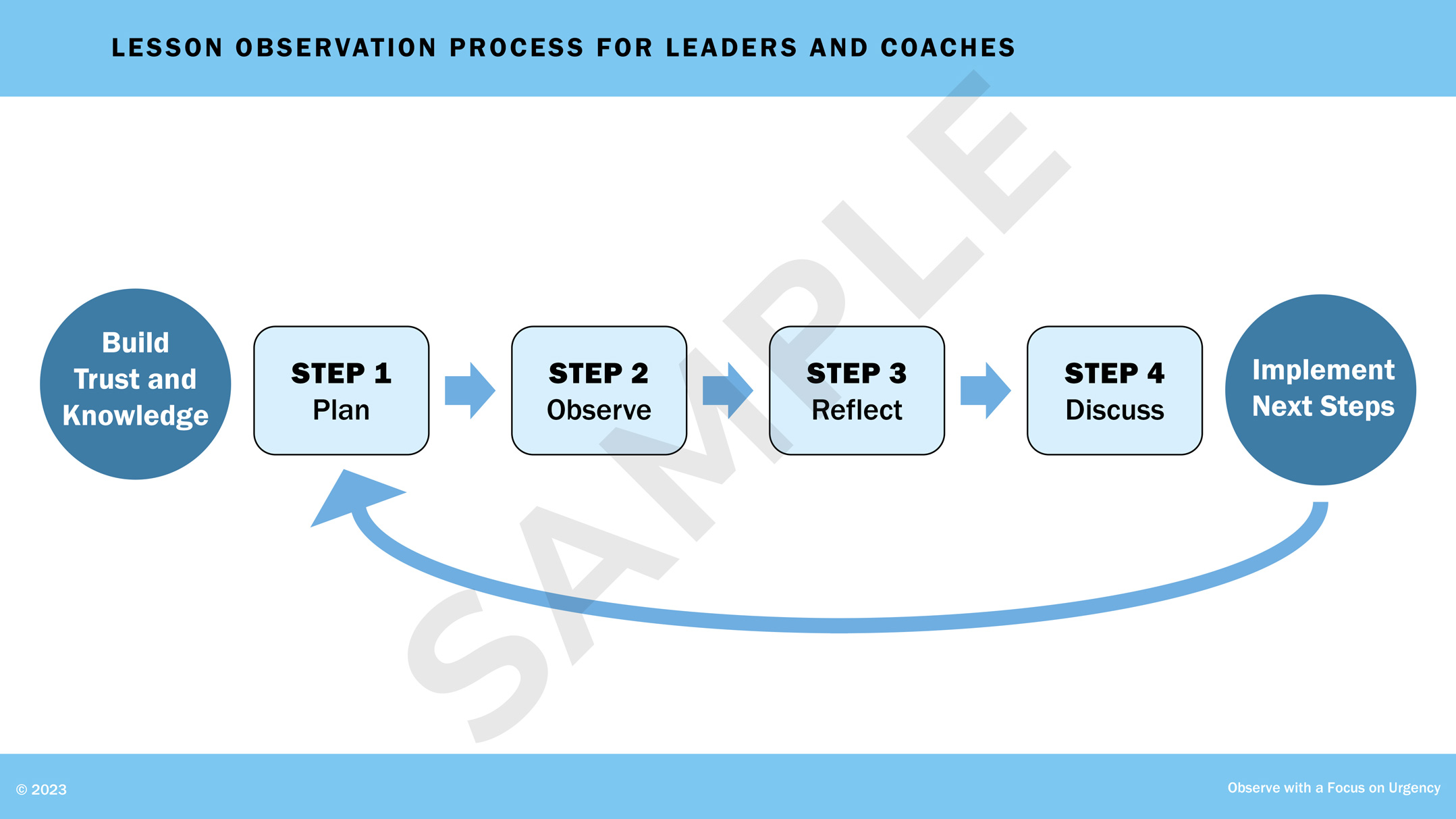
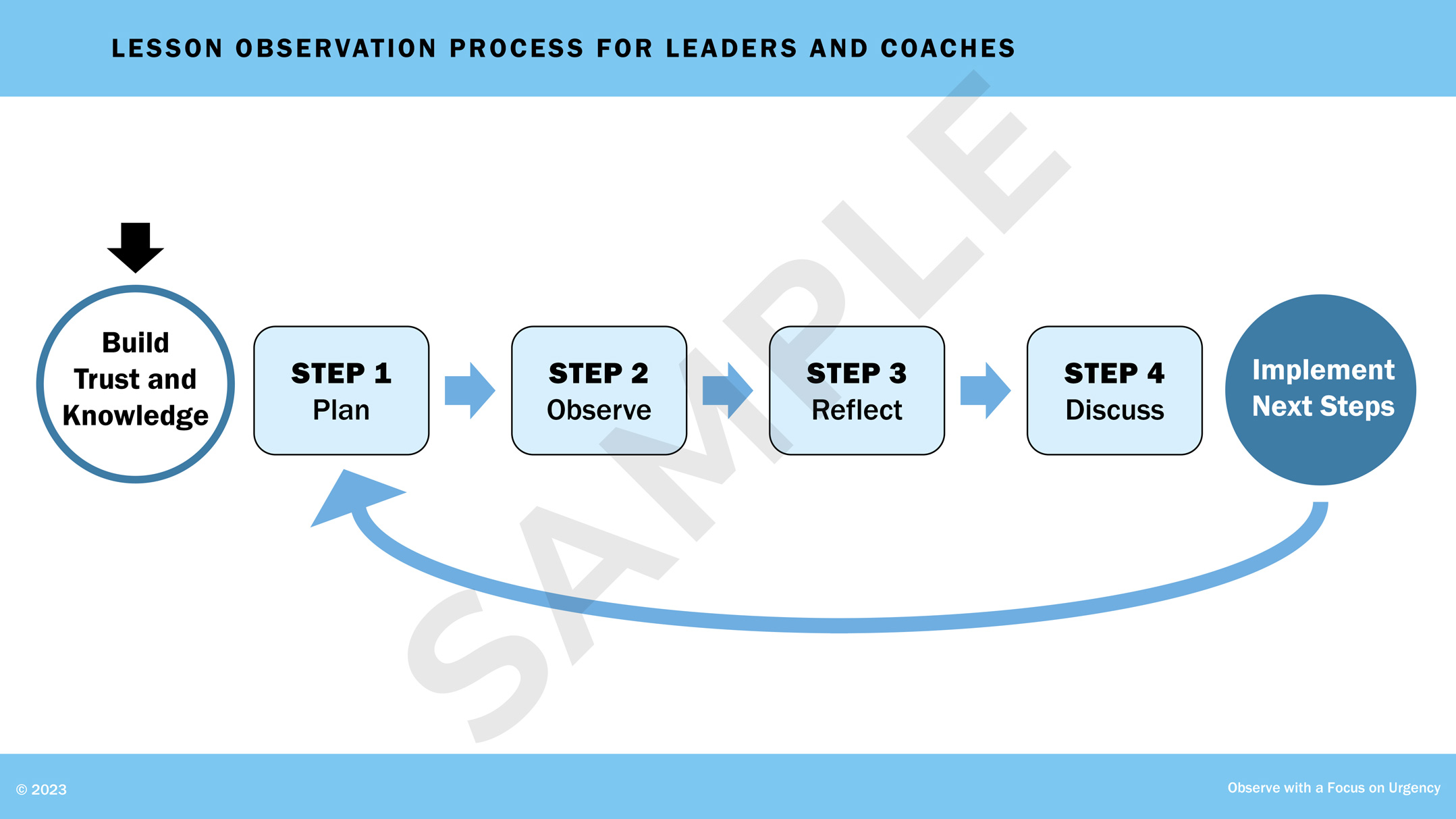
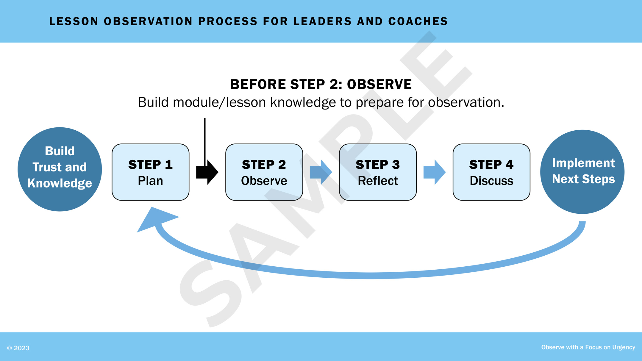
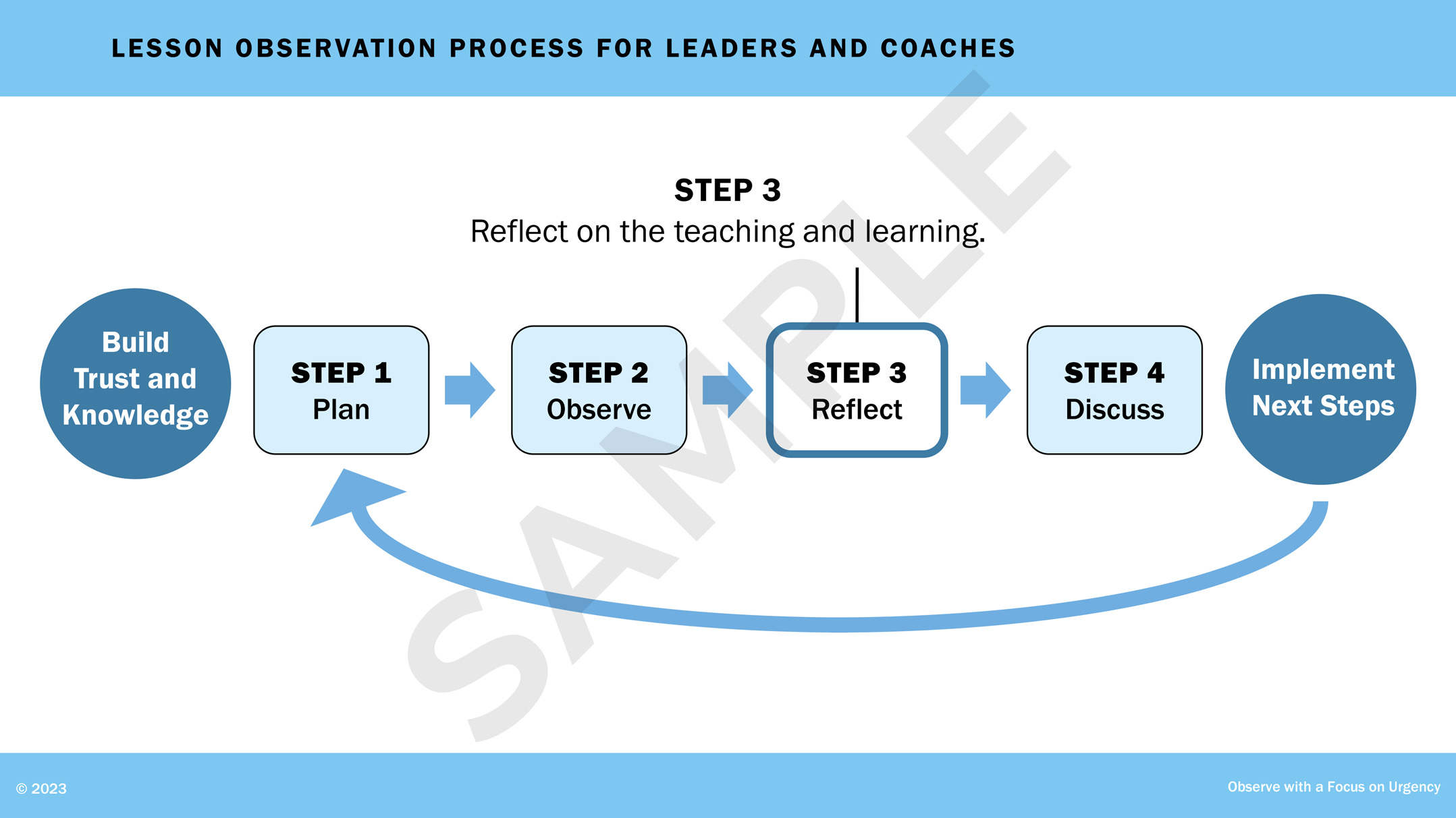
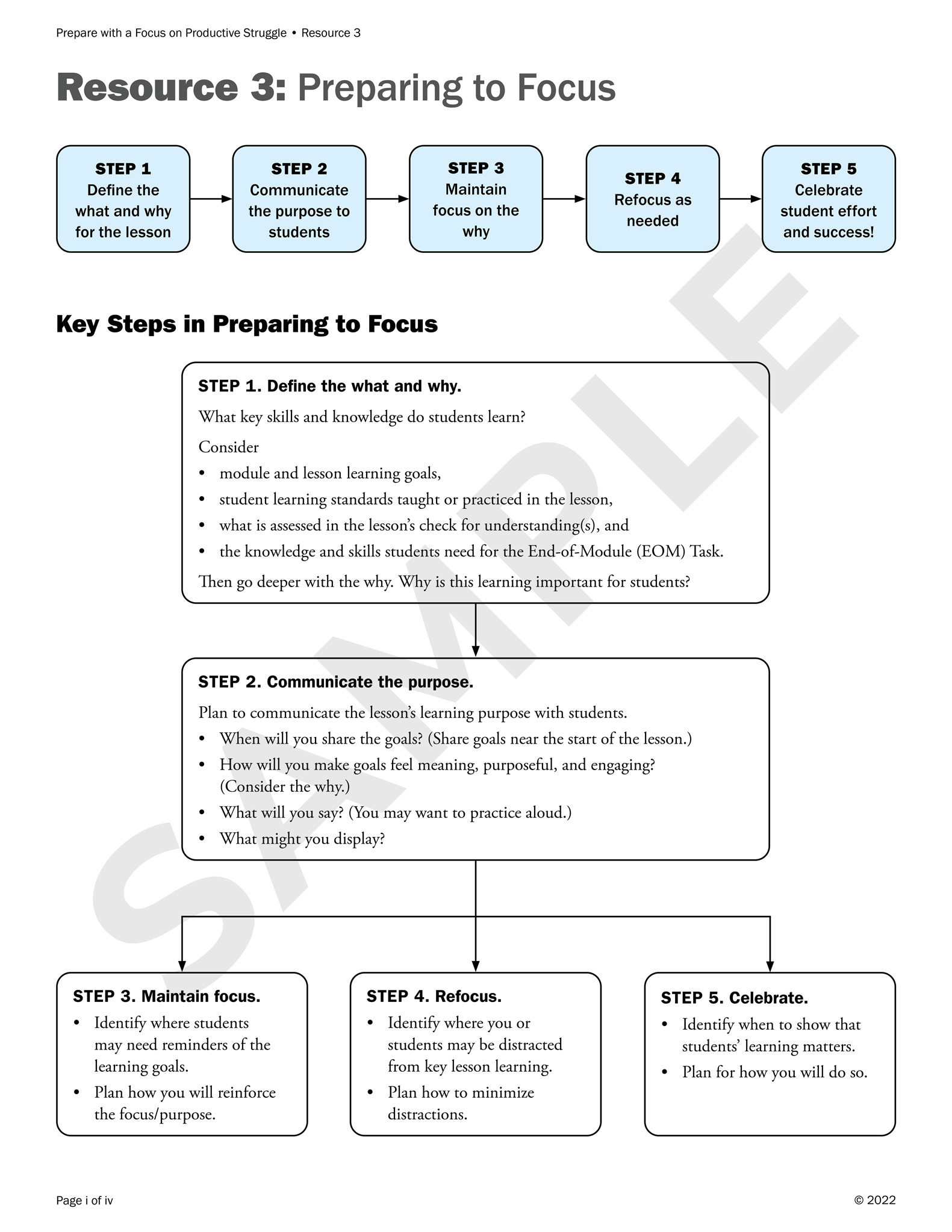
Coaching Series for Teachers: Presentation

Using existing branding, I developed a PowerPoint deck for a professional-learning series (selected slides shown; name and logo removed for anonymity). The deck elucidated the idea of urgency in teaching and outlined ways in which leaders can coach teachers effectively.

By arranging the content, creating vector graphics, and suggesting steps for animation, I helped the writers clarify their message.

Slide from a PowerPoint presentation for a learning series for teachers. The infographic includes three sections that define urgency in teaching: what urgency looks like, with an icon of an eye; what urgency feels like, with an icon of an ear; and what urgency feels like, with an icon of a hand. Text accompanies each section. Slide from a PowerPoint presentation for a learning series for teachers. The infographic includes clock icons to represent the impact of urgency in teaching in minutes per day, week, and year. Slide from a PowerPoint presentation for a learning series for teachers. A flow chart shows the essential actions for urgency in teaching: focus, with an icon of a teacher at the board; pace, with an icon of a clock; and achievement of learning goals, with a star. Slide from a PowerPoint presentation for a learning series for teachers. A flow chart shows the steps in the lesson observation process: build trust and knowledge, plan, observe, reflect, discuss, and implement next steps. Slide from a PowerPoint presentation for a learning series for teachers. A flow chart shows the steps in the lesson observation process: build trust and knowledge, plan, observe, reflect, discuss, and implement next steps. The step of 'build trust and knowledge' is highlighted. Slide from a PowerPoint presentation for a learning series for teachers. A flow chart shows the steps in the lesson observation process: build trust and knowledge, plan, observe, reflect, discuss, and implement next steps. The arrow between 'plan' and 'observe' is highlighted, emphasizing the importance of building knowledge of the lesson to prepare for observation. Slide from a PowerPoint presentation for a learning series for teachers. A flow chart shows the steps in the lesson observation process: build trust and knowledge, plan, observe, reflect, discuss, and implement next steps. The step of 'reflect' is highlighted. Slide from a PowerPoint presentation for a learning series for teachers. An infographic shows the difference between professional development and coaching. A cube within a snug container represents professional development. A cube within a container that is large and expanding represents coaching; arrows pointing outward represent expansion.

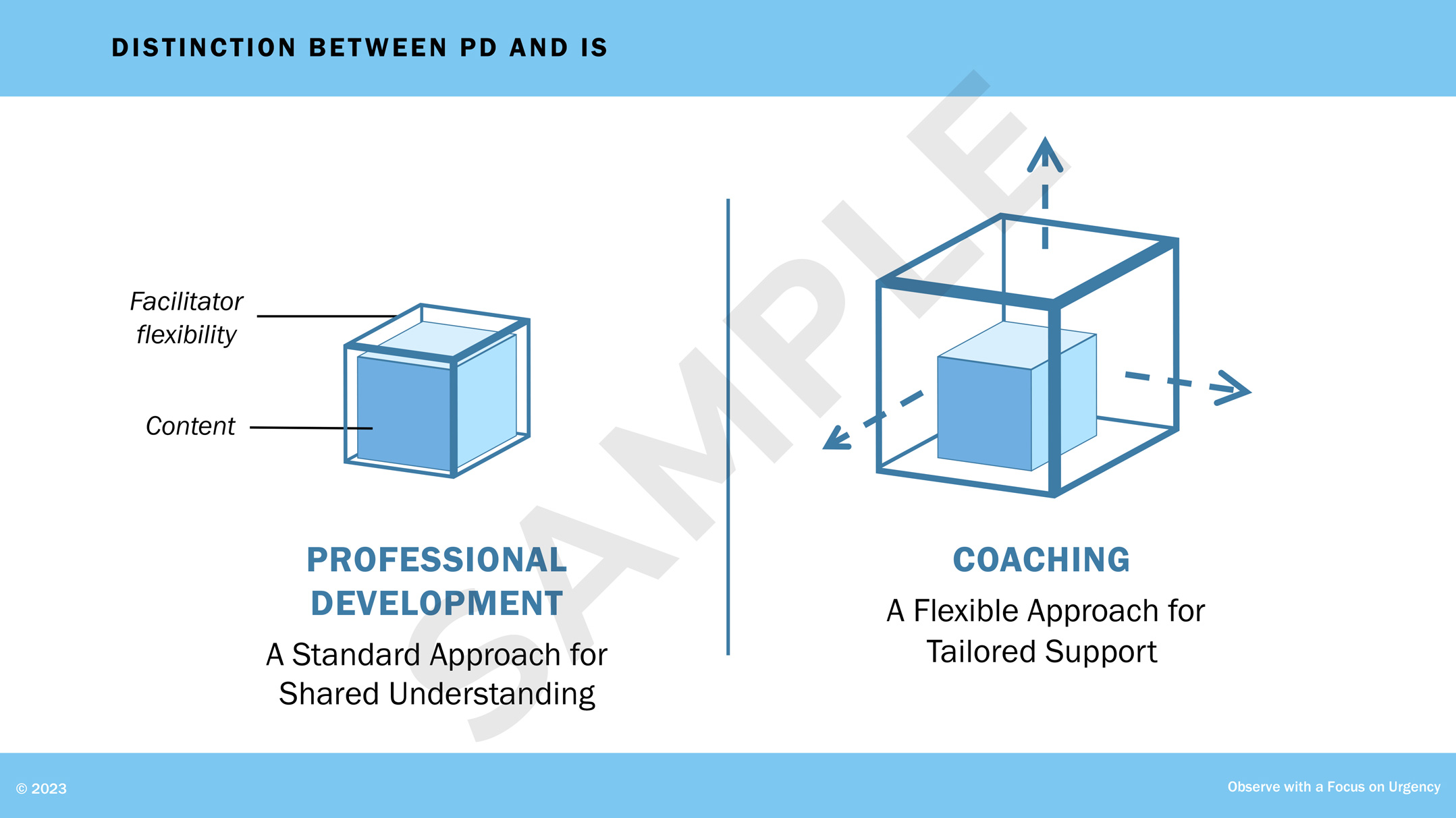
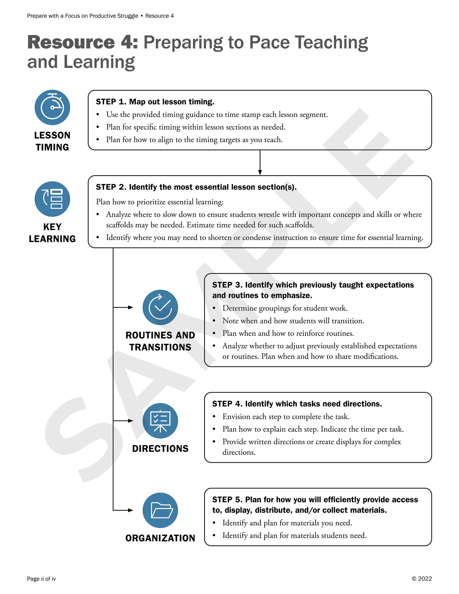
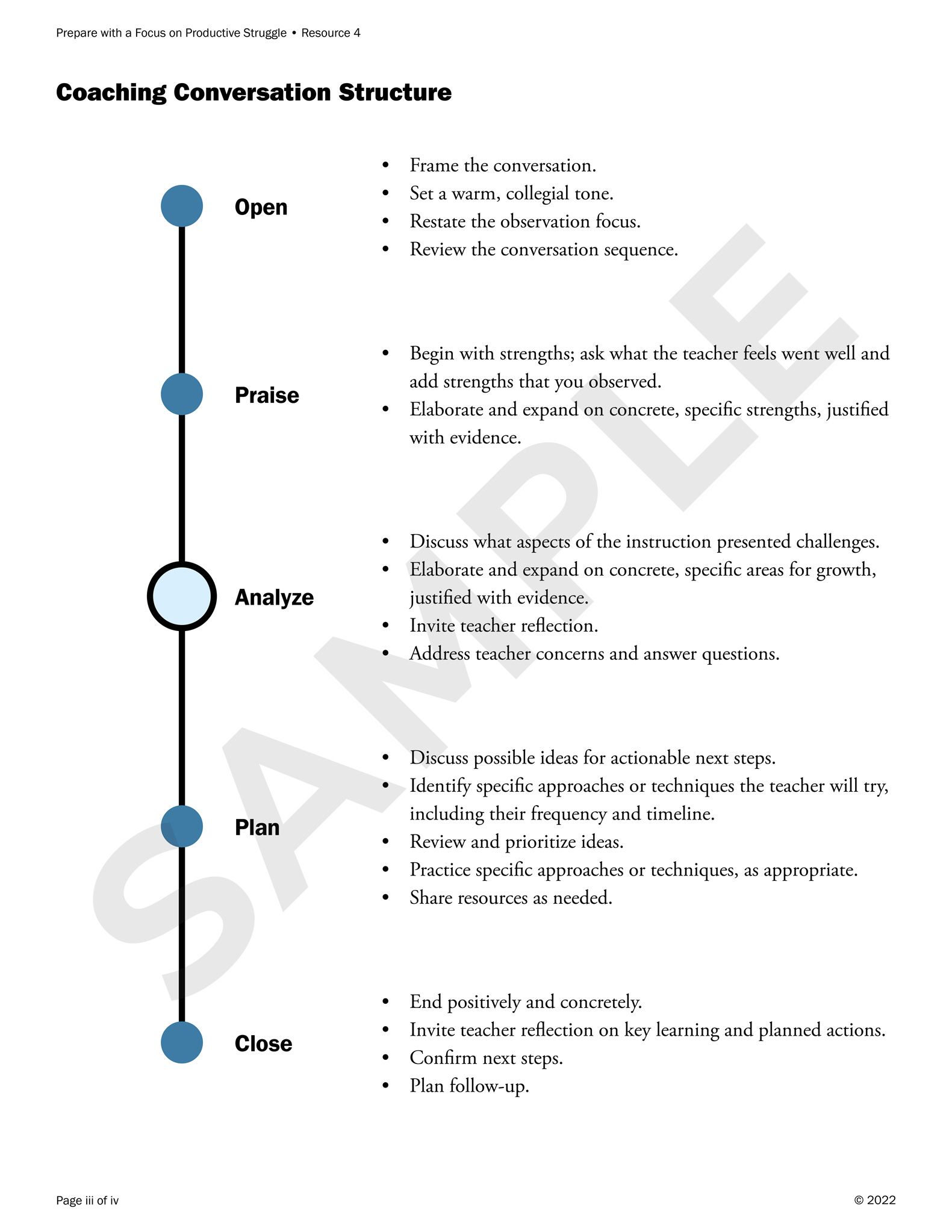
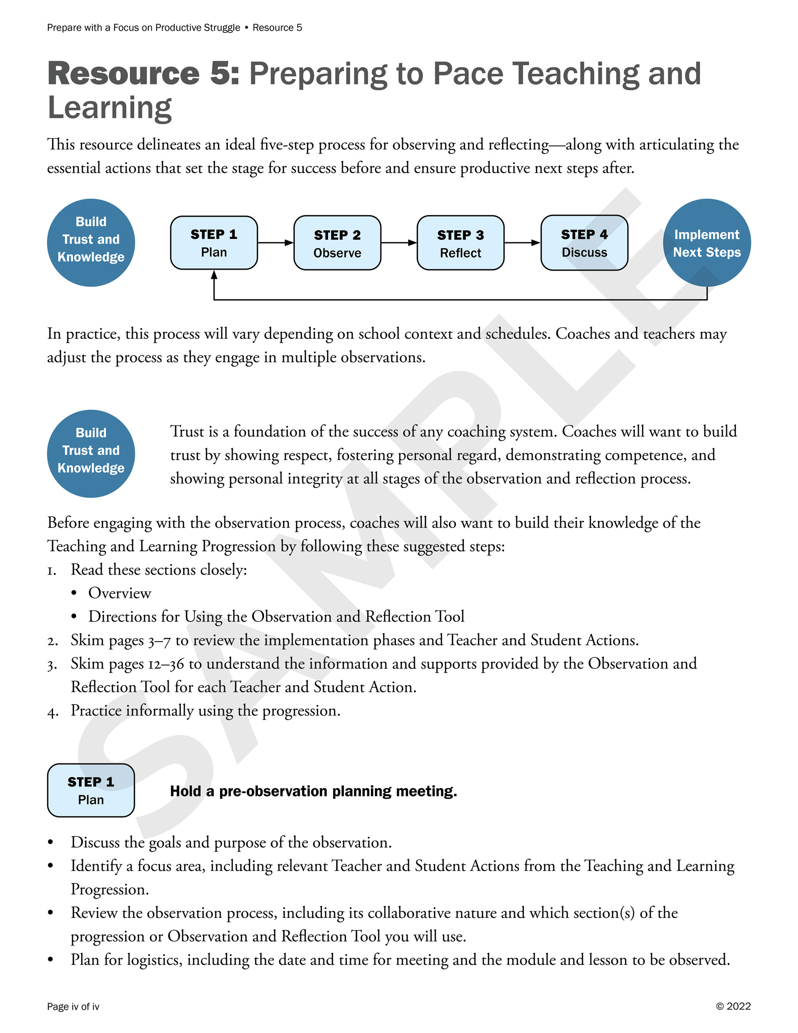
Coaching Series for Teachers: Handout

Targeted to the same group of teachers, this handout (representative pages shown) elaborated on the concepts in the above PowerPoint deck.

Page from a handout for a learning series for teachers. Two flow charts show the steps in preparing to focus students' learning. The first chart names and summarizes the steps: define the what and why, communicate the purpose, maintain focus, refocus, and celebrate. The second, larger, chart describes the steps using bullet points. Page from a handout for a learning series for teachers. A flow chart shows the steps in preparing to pace teaching and learning. Next to each box within the chart is an icon representing the step: a stopwatch for lesson timing; a stack of rectangles for key learning; a checkmark within a circular arrow for routines and transitions; a blackboard for directions; and a folder for organization. Page from a handout for a learning series for teachers. Down the left side is a line with large dots representing the steps in coaching conversation structure: open, praise, analyze, plan, and close. Next to each step are bullets points describing the step. Page from a handout for a learning series for teachers. At the top, a flow chart shows the steps in the lesson observation process: build trust and knowledge, plan, observe, reflect, discuss, and implement next steps. Descriptive text follows.

Financial Institution

I designed two versions of an infographic for an esteemed investment-research group (name and logo removed for anonymity), choosing a palette that was suitable for the content and audience.

Infographic for a financial company. On the top, icons accompany data on clients, employees, assets, deposits, and market cap. In the center, a map of the Middle East incorporates data on branches, ATMs, employees, and assets for banks in Saudi Arabia, Turkey, and Bahrain. On the bottom, horizontally stacked bar graphs plot loan mix and deposit mix.
Infographic for a financial company. On the top, icons represent the number of clients and employees, and a bar graph plots assets, deposits, and market cap. In the center, country outlines for Saudi Arabia, Turkey, and Bahrain accompany data on branches, ATMs, employees, and assets for banks in those countries. On the bottom, icons accompany data on loan mix and deposit mix.

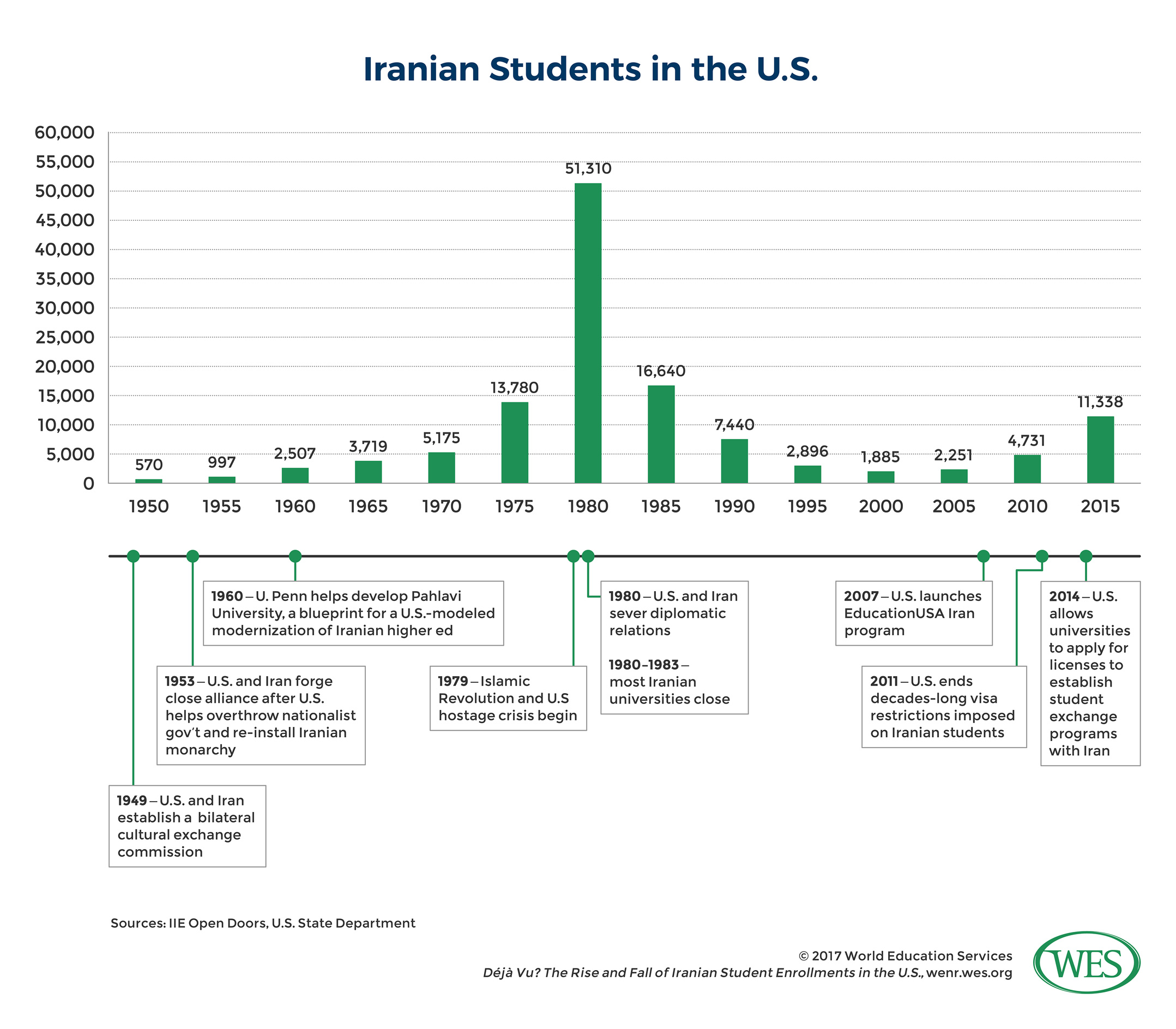
World Education Services (WES): Bar Graph and Timeline

This piece accompanied an article on Iranian students in the US.

Since the publication of this infographic, I have darkened the lines in the bar graph and timeline in order to comply with WCAG standards.

Infographic on Iranian students in the United States. In the top half, a bar graph shows the number of students from 1950 to 2015. In the bottom half, a timeline lists key events in Iran-U.S. relations that affected students.

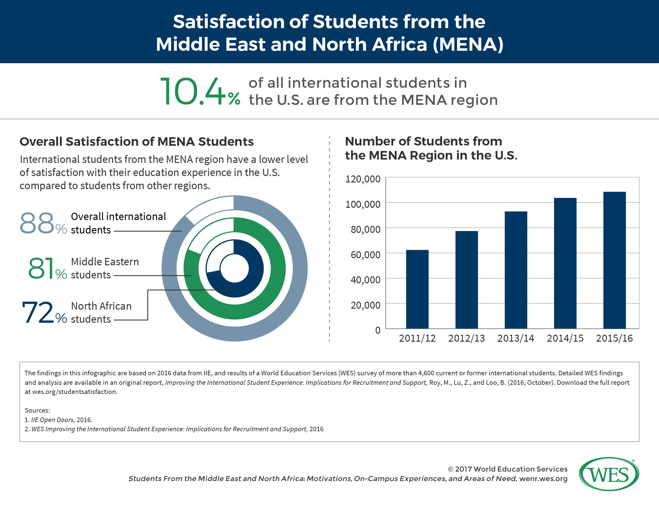
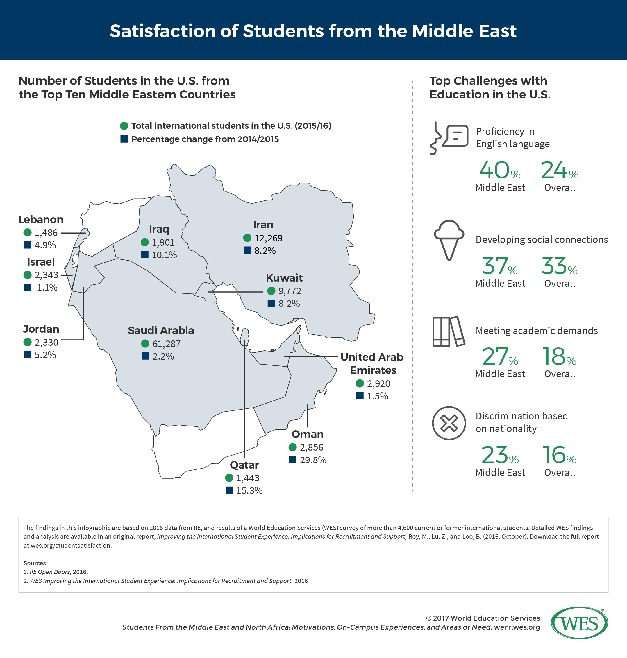
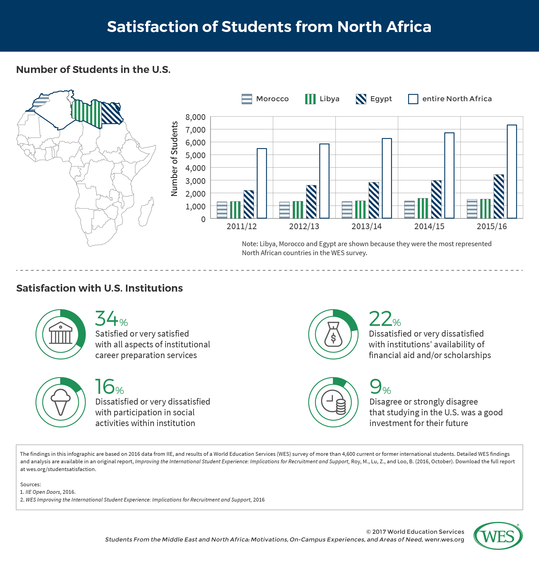
World Education Services: Multipage Infographic

I transformed raw data into a set of graphs, maps, and icon-based lists for an article on the experiences of Middle Eastern and African students in US schools. I incorporated WES’ branding into a novel design.

See other projects that I completed for WES:

I have changed this infographic since its publication in order to comply with WCAG standards. New and altered elements include the color of header sections; the colors of bars and circles within graphs; the colors of and the legend within the map on the second slide; and the patterns within the map and bar graph on the third slide.

Infographic on students from the Middle East and North Africa in the United States. On the left, three concentric pie graphs show satisfaction with educational experiences overall, among students from the Middle East, and among students from North Africa, respectively. On the right, a bar graph plots the population of students from 2011 to 2016. Infographic on students from the Middle East in the United States. On the left, a map of the Middle East includes the number of students from Iran, Iraq, Israel, Jordan, Kuwait, Lebanon, Oman, Qatar, Saudia Arabia, and the United Arab Emirates, in 2015 and 2016; it also reveals the percentage of change from 2014 and 2015. On the right, icons accompany data on challenges with language, social connections, academic demands, and discrimination. Infographic on students from North Africa in the United States. In the top half, a map of North Africa and a bar graph show the number of students from Morocco, Libya, Egypt, and the entire North African region, from 2011 to 2016. In the bottom half, icons accompany data on students' satisfaction with career-preparation services, social activities, availability of financial aid, and investment for the future.

Humanitarian Nonprofit

I built a responsive email to update subscribers about the client’s critical rescue work (client’s name and logo removed for anonymity). In addition to creating the infographics (scroll in the email window to view them), I wrote the copy, designed the look, selected and color corrected the photos, and coded the file.

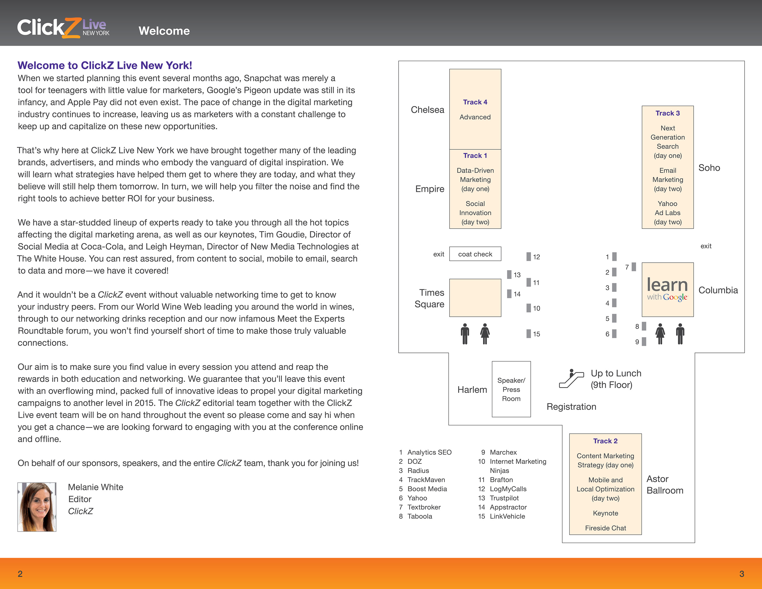
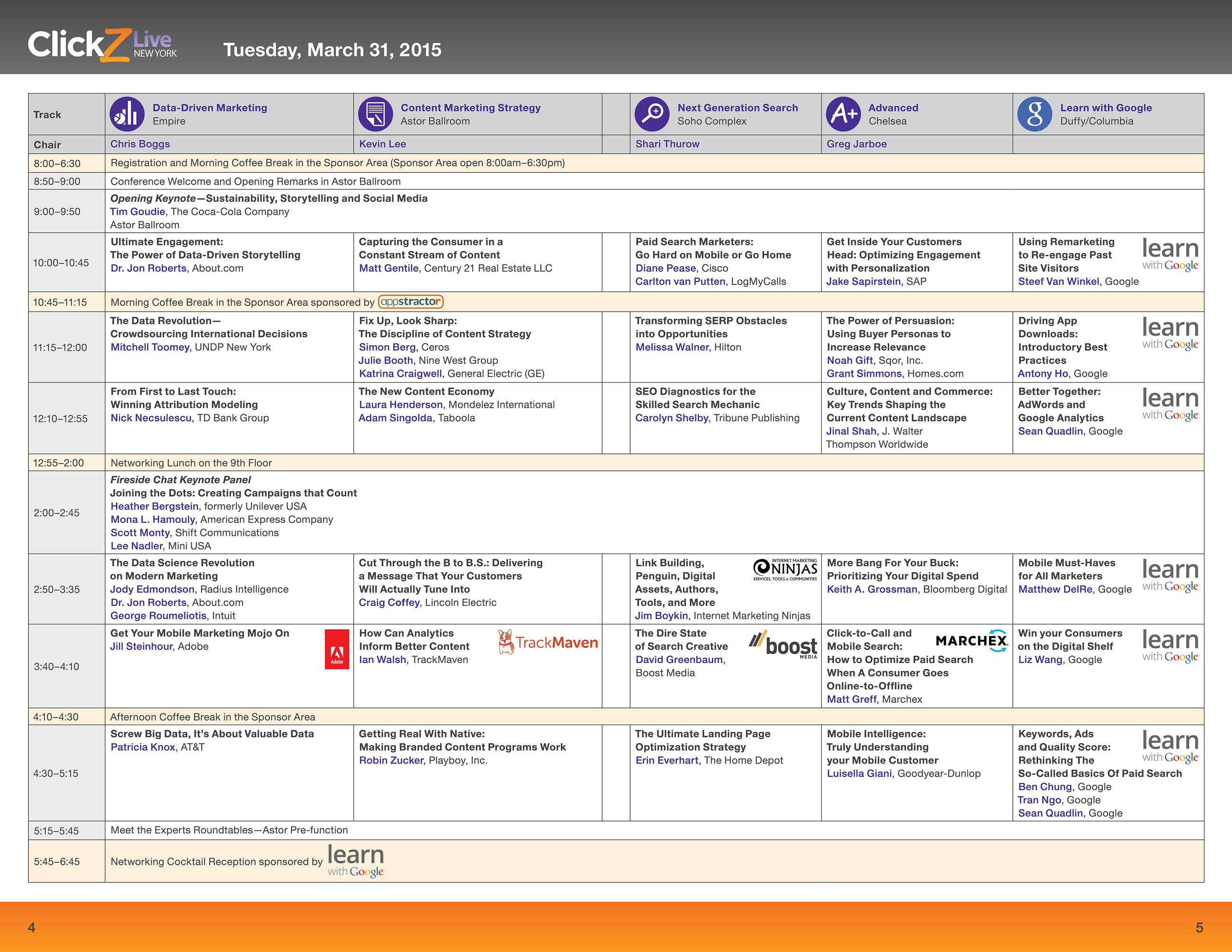
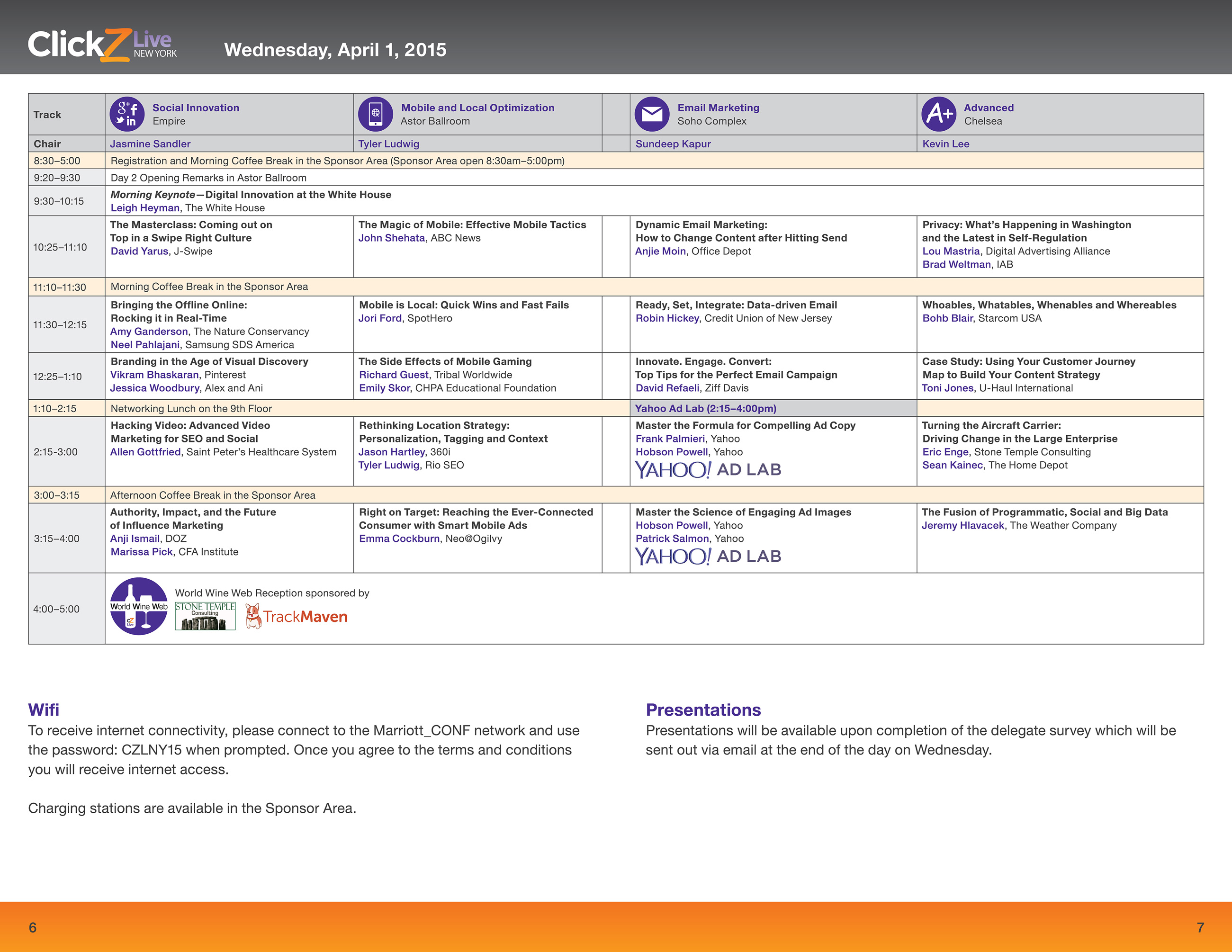
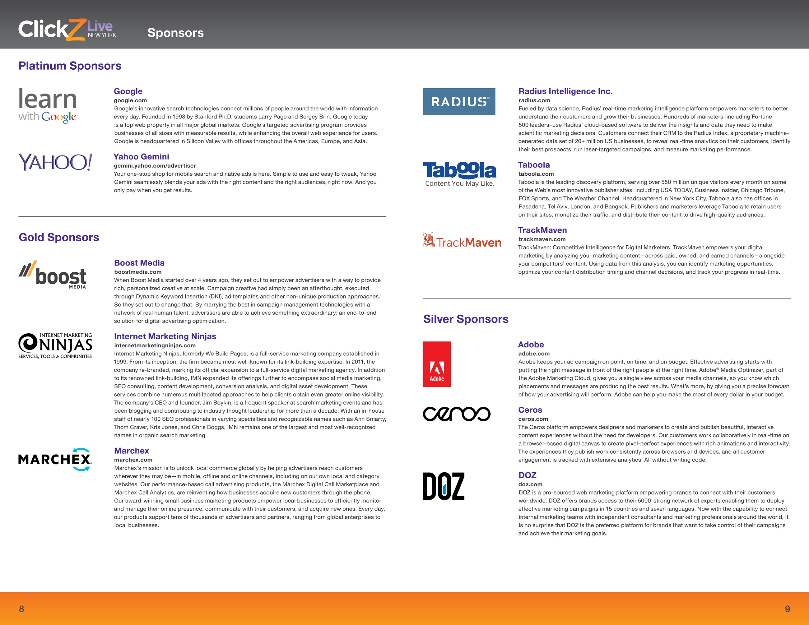
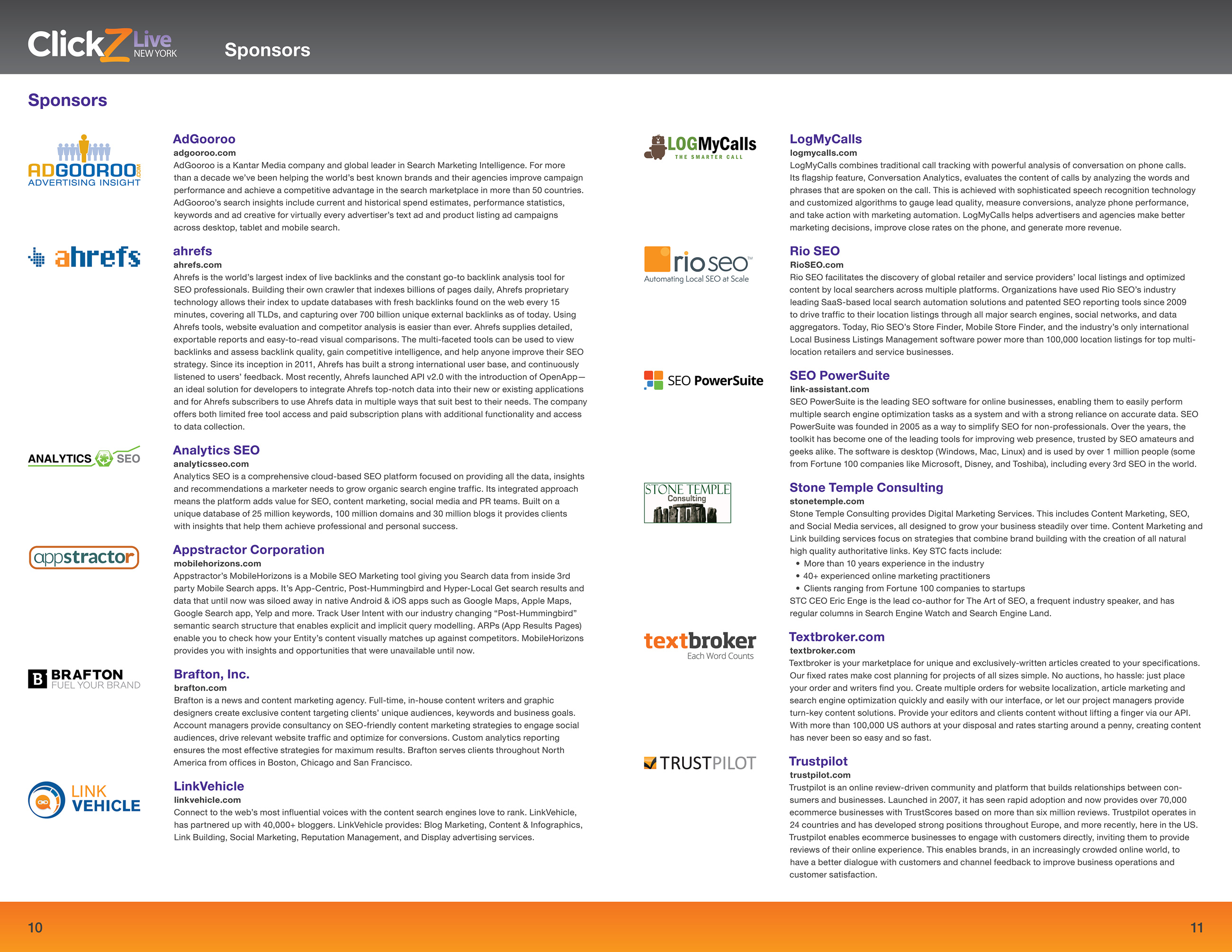
ClickZ: Conference Guide

The ClickZ conference series attracted 5,000+ digital-marketing professionals per year. I originated a small-format printed guide (page size 5.5″ x 8.5″), reducing paper usage and printing costs. The guide still contained all necessary information, including floor plans, agendas, and sponsors’ descriptions.

See my other work for ClickZ:

Front cover of the conference guide for ClickZ Live New York. Includes ClickZ Live New York logo, conference information, photos of people networking, and sponsors' logos. Spread from the conference guide for ClickZ Live New York. Includes welcome letter. Also includes floor plan of the space at the New York Marriott Marquis, incorporating classroom areas and presenters' booths. Spread from the conference guide for ClickZ Live New York. Shows the agenda for the first day of the conference in tabular format, broken down by the following content tracks: data-driven marketing, content marketing strategy, next-generation search, advanced, and Learn with Google. Spread from the conference guide for ClickZ Live New York. Shows the agenda for the second day of the conference in tabular format, broken down by the following content tracks: social innovation, mobile and local optimization, email marketing, advanced, and Yahoo Ads. Spread from the conference guide for ClickZ Live New York. Shows descriptions and logos of the platinum, gold, and silver sponsors. Platinum sponsors are Google and Yahoo. Spread from the conference guide for ClickZ Live New York. Shows descriptions and logos of sponsors. Back cover of the conference guide for ClickZ Live New York. Provides information about the ClickZ Live app and shows how the app looks on a phone.

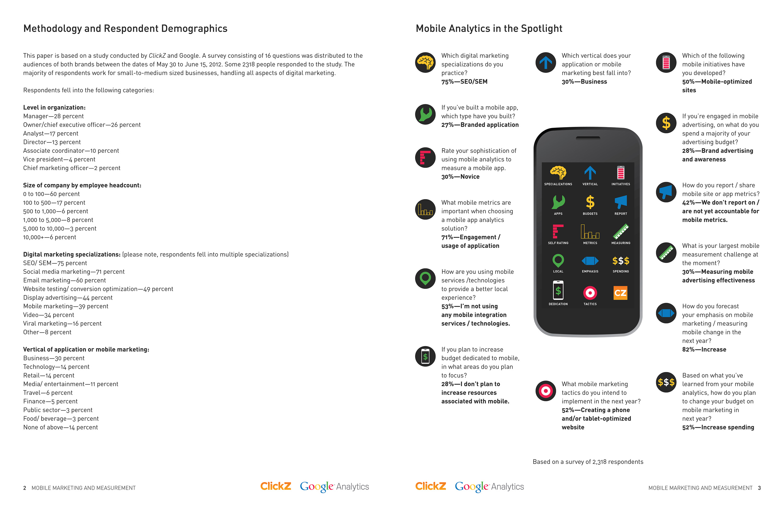
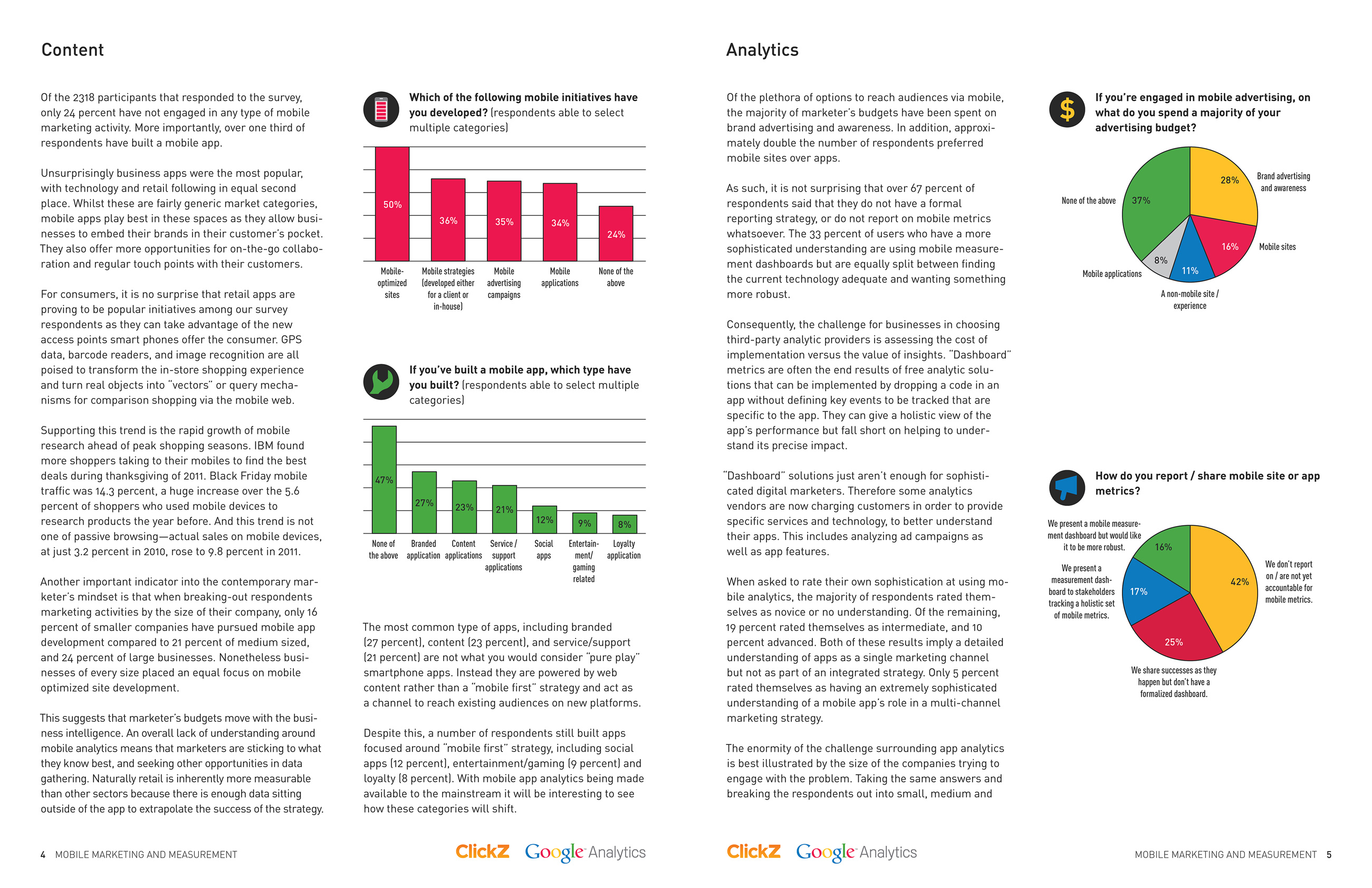
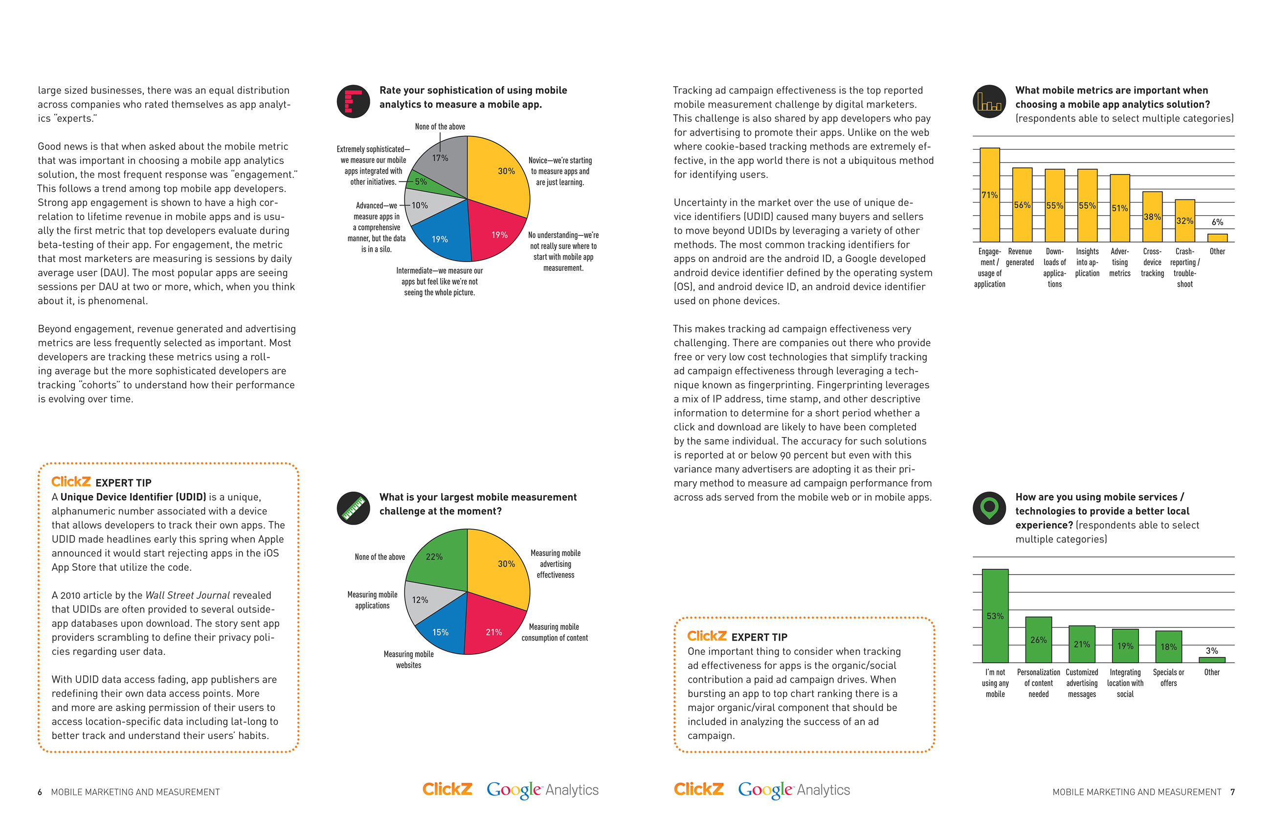
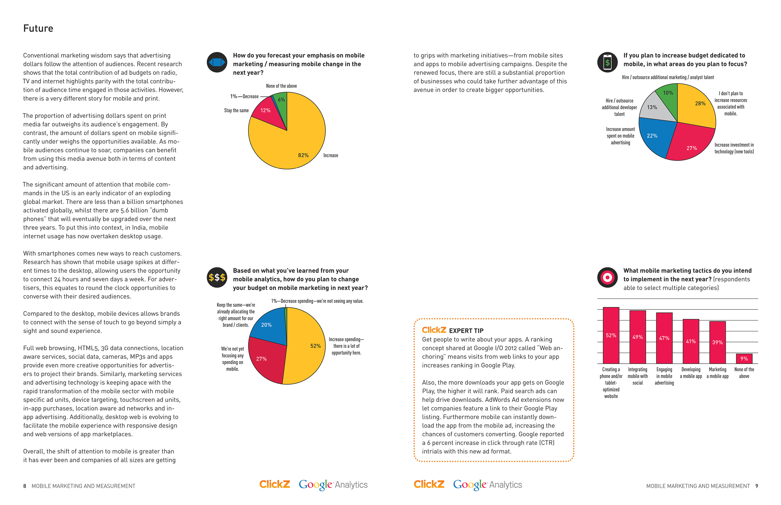
ClickZ: Report with Google Analytics

This report presented the results of a survey on mobile marketing and analytics. I used both Google’s and ClickZ’s colors in this jointly issued piece. Color and iconography connect the main infographic to the bar and pie charts that follow.
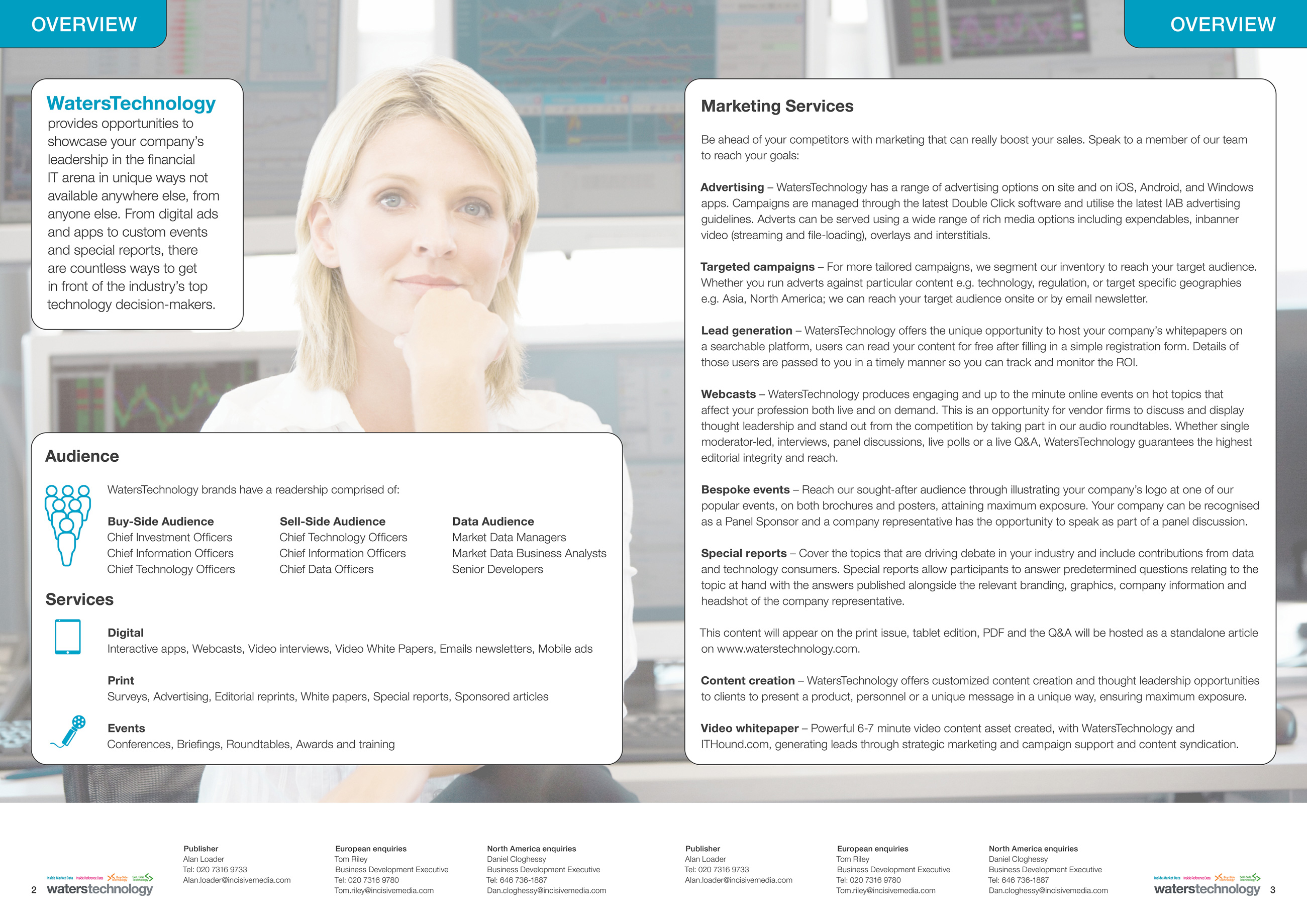
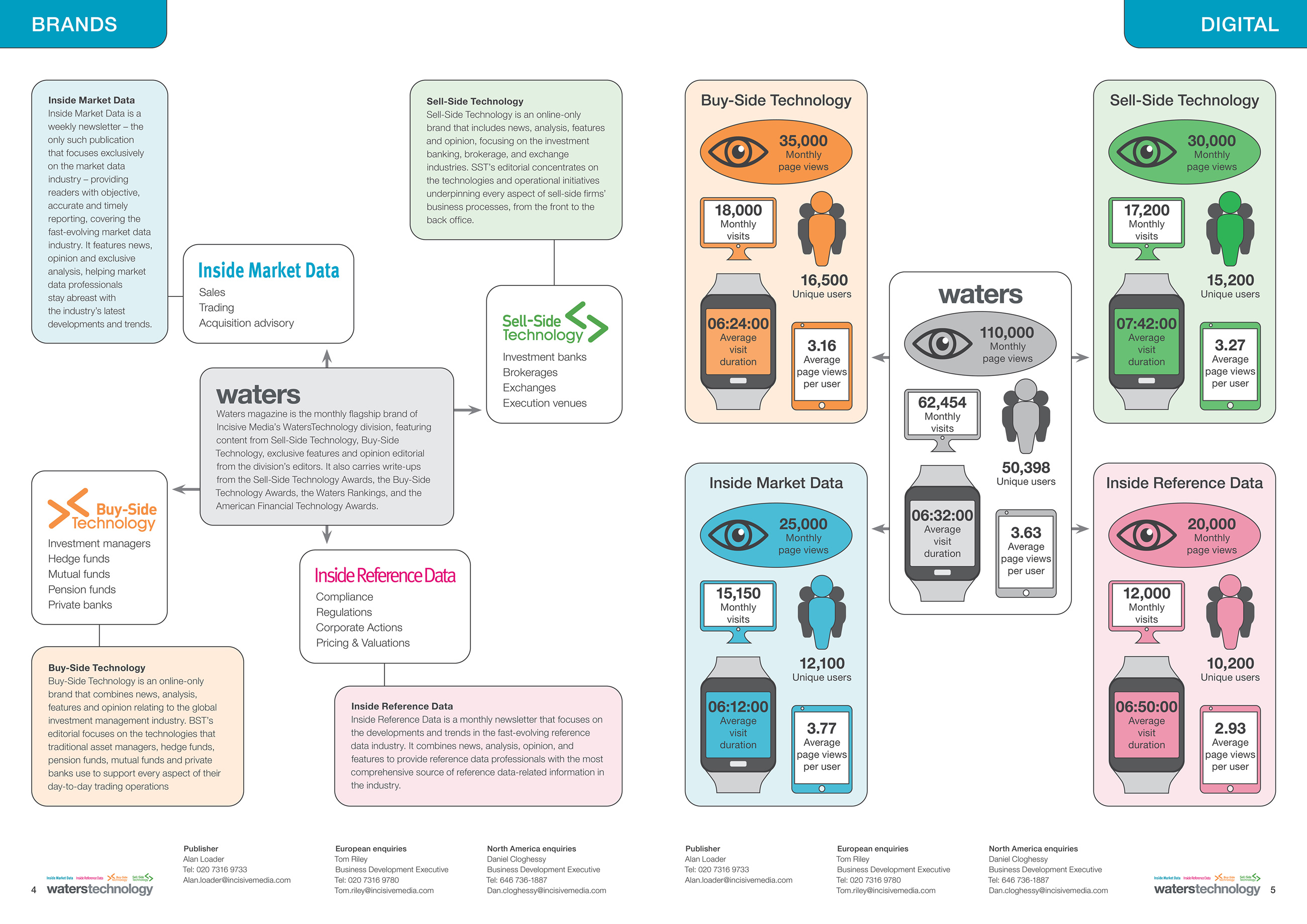
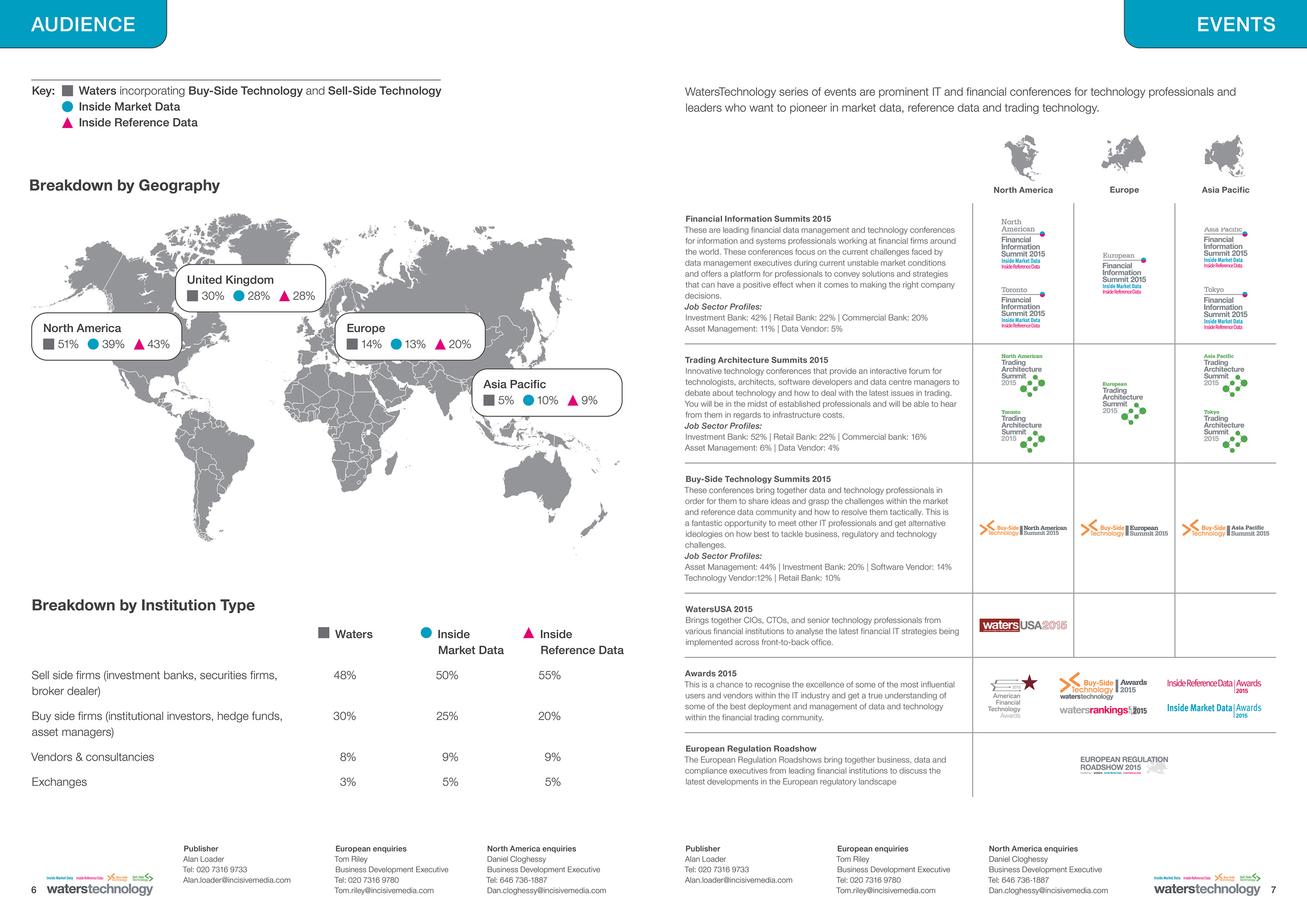
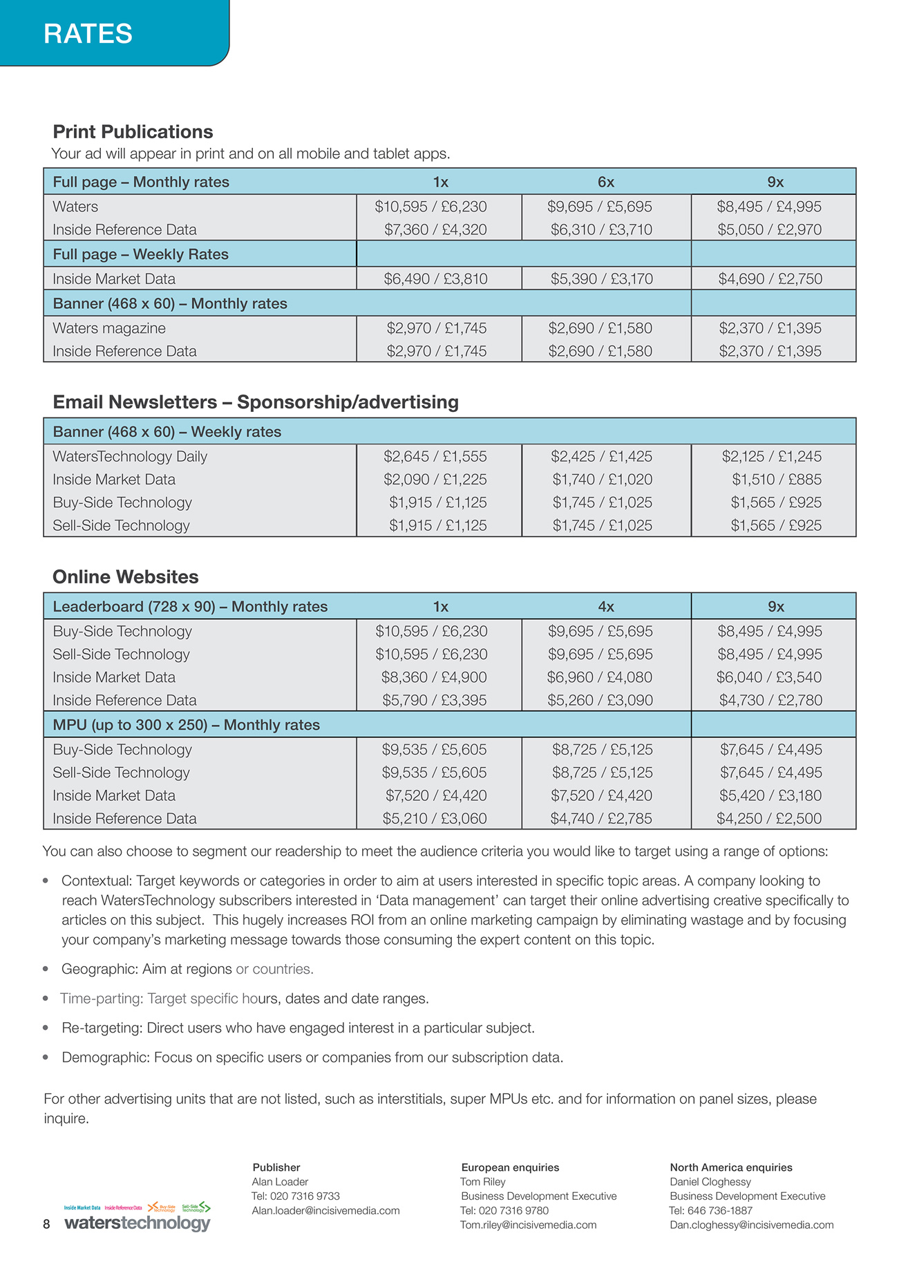
Front cover of a report titled 'Mobile Marketing and Measurement.' Logos for the joint publishers, ClickZ and Google Analytics, appear on the top. Below is an image of a mobile phone; the report title appears in white type within the phone. Inside spread of a report titled 'Mobile Marketing and Measurement' and published jointly by ClickZ and Google Analytics. On the left-hand page, the introduction describes the report's methodology and respondents' demographics. On the right-hand page, an image of a mobile phone sits at the center of an infographic; icons and labels appear within the phone. The icons are repeated in the space surrounding the phone, each next to the related survey question. The icons are in Google's colors: red, blue, green, and yellow. Inside spread of a report titled 'Mobile Marketing and Measurement' and published jointly by ClickZ and Google Analytics. The left-hand page contains information and two bar graphs on respondents' answers to questions about content. The right-hand page provides information and two pie graphs on respondents' answers to questions about analytics. The graphs are in Google's colors: red, blue, green, and yellow. Inside spread of a report titled 'Mobile Marketing and Measurement' and published jointly by ClickZ and Google Analytics. It continues the previous section on analytics and contains two pie graphs and two bar graphs in Google's colors: red, blue, green, and yellow. It also includes two sections that are titled 'Expert Tip' and bordered by ClickZ's color, orange. One section is on unique device identifiers (UDIDs), and one is on considerations for tracking ad effectiveness. Inside spread of a report titled 'Mobile Marketing and Measurement' and published jointly by ClickZ and Google Analytics. It contains information, three pie graphs, and one bar graph on the future of mobile marketing. The graphs are in Google's colors: red, blue, green, and yellow. It also includes a section that is titled 'Expert Tip' and bordered by ClickZ's color, orange. The tip is about ways to improve rank on Google Play.

Waters Technology

I designed a brochure for a family of publications covering financial information technology. Given the raw text and data, I determined the best arrangement for the information and devised tables and infographics that sustained visual interest.
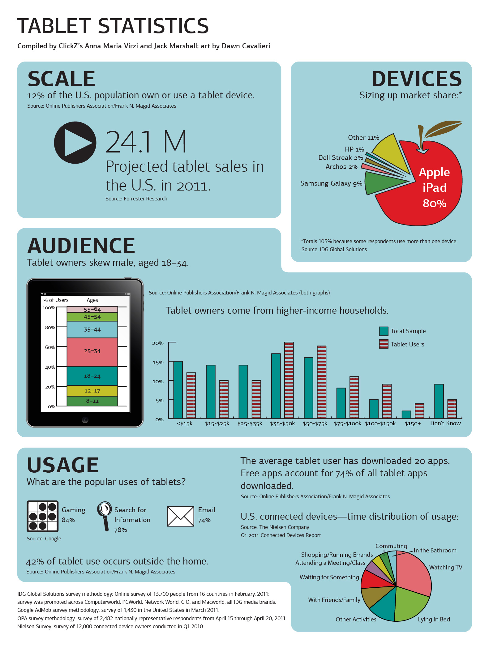
Front cover of brochure for Waters Technology. Includes the Waters logo and the logos for Waters' publications: Inside Market Data, Inside Reference Data, Buy-Side Technology, and Sell-Side Technology. The background is dark grey. Inside spread of brochure for Waters Technology. The background is a photo of a woman standing in front of a bank of computer monitors and looking at the camera. Large areas of text describe Waters' audience and services. Inside spread of brochure for Waters Technology. On the left-hand page, a flow chart provides logos of and information on Waters and its publications: Inside Market Data, Inside Reference Data, Buy-Side Technology, and Sell-Side Technology. On the right-hand page, an infographic offers data for all brands on monthly page views, monthly visits, unique users, average visit duration, and average page views per user, with accompanying icons. Inside spread of brochure for Waters Technology. On the left-hand page, data on Waters' audience superimposes a world map. The data is broken down by region: North America, the United Kingdom, continental Europe, and the Asia-Pacific region. Below the map, a table classifies audience by institution type. On the right-hand page, a table lists Waters' events in North America, Europe, and the Asia-Pacific region, with descriptions and event logos. Back cover of brochure for Waters Technology, with a table listing rates for marketing in print publications, email newsletters, and websites, within Waters' products: Inside Market Data, Inside Reference Data, Buy-Side Technology, and Sell-Side Technology.

SES Magazine

This infographic appeared in the magazine issued by Search Engine Strategies, the predecessor brand of ClickZ.

Learn more about my work for the publication.

Since the release of this infographic, I have modified the pie and bar charts—adding borders, changing colors, incorporating patterns, and rearranging type—in order to comply with WCAG standards.

Infographic from SES Magazine showing data on tablets. A play button accompanies data on scale. A pie graph, with an apple instead of a circle, presents data on market share. A stacked bar graph, which appears within an illustration of a mobile device, plots data on audience. Icons for gaming, search, and email, and a pie graph show data on usage.

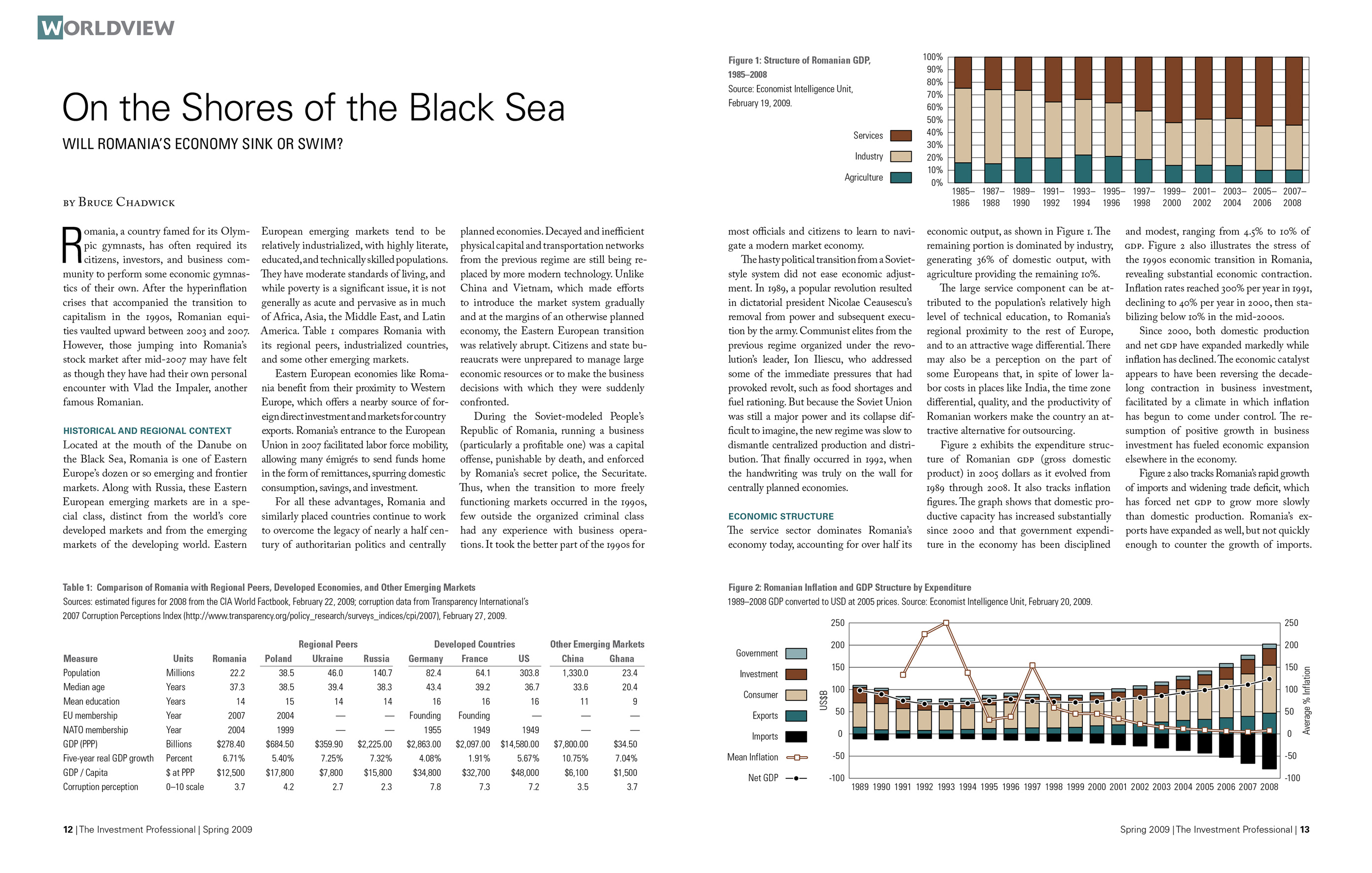
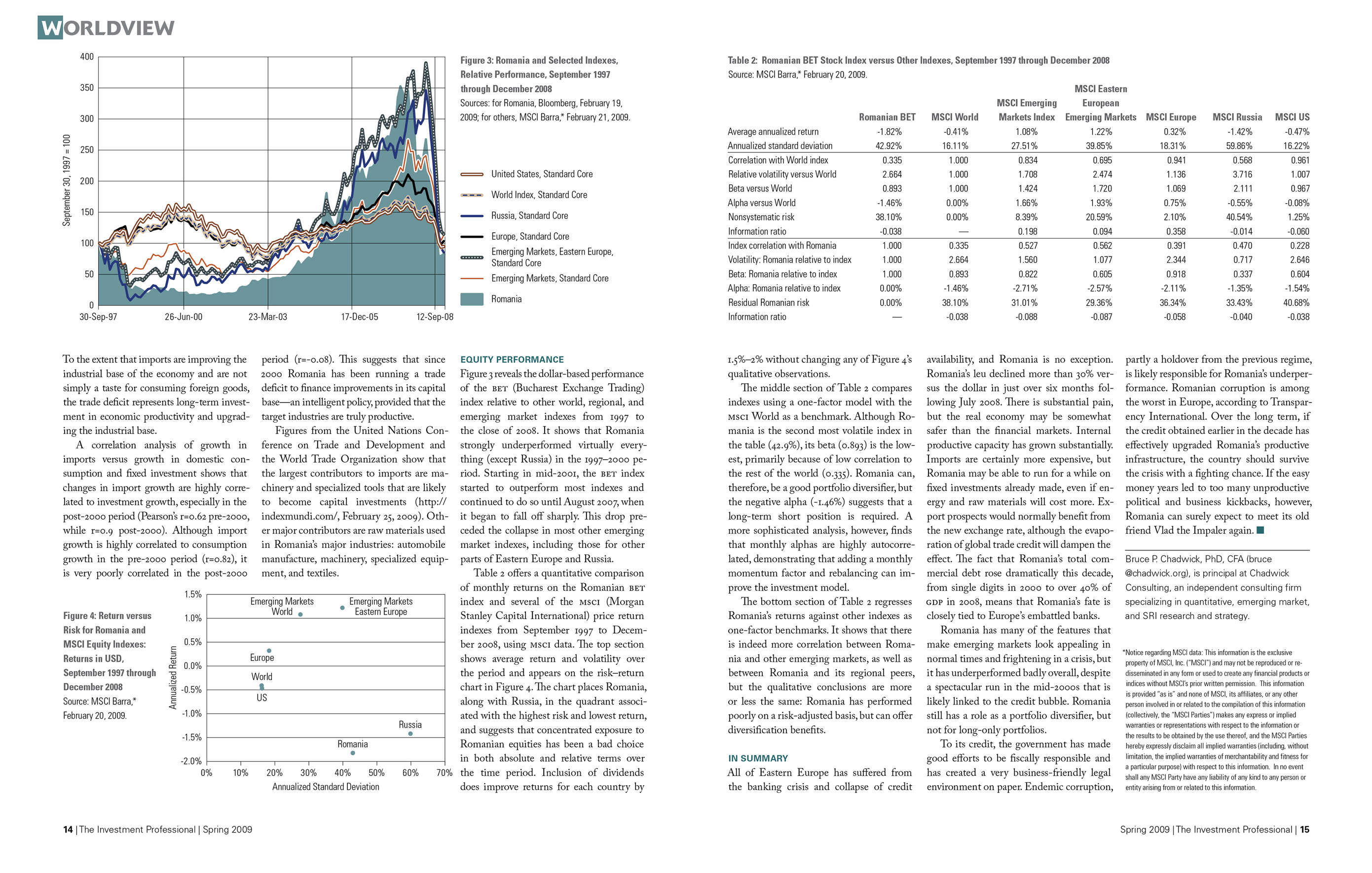
Column in The Investment Professional

I designed many graphs and tables as part of my work for a publication in the financial industry; this article shows six examples.

Opening spread of an article in The Investment Professional magazine, titled 'On the Shores of the Black Sea: Will Romania’s Economy Sink or Swim?' A table compares Romania with several other nations. Bar and line graphs in blue and brown cover Romania's GDP and inflation. Second spread of the article titled 'On the Shores of the Black Sea.' A line graph in blue and brown plots the relative performance of Romania's index against selected indexes. A dot graph displays return versus risk for Romania and the MSCI Equity Index. A table compares the Romanian BET Stock Index with other indexes.

Feature in The Investment Professional

An infographic adds interest to a page that holds the headline and subhead. See the full article.

Infographic for article in The Investment Professional magazine titled 'A Watershed Moment: Calculating the Risks of Impending Water Shortages.' A full-page illustration of a water glass in blue tones serves as a backdrop for an infographic on percentages of world water usage by industry.